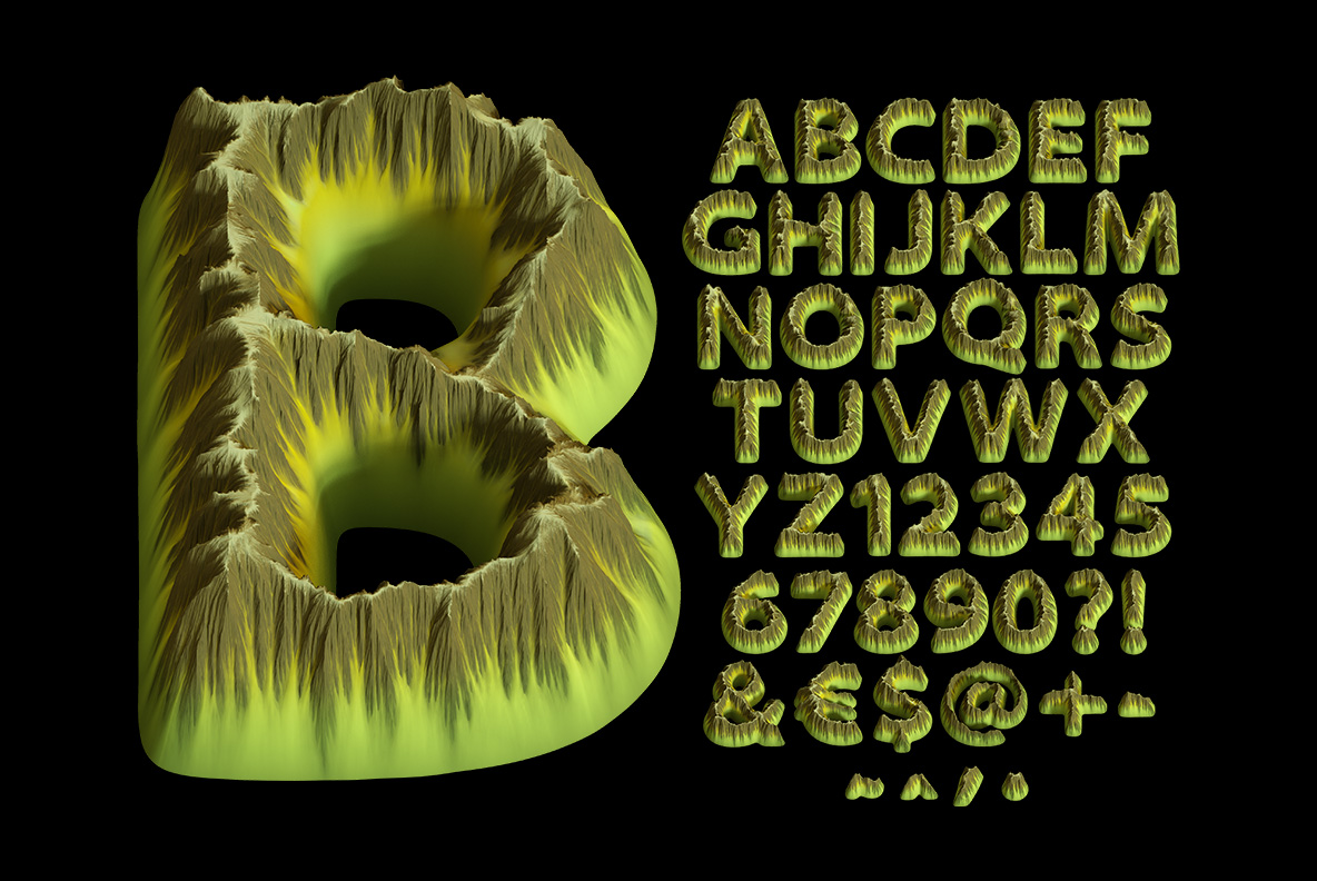
Each letter is a small island seen from just above the water: flat sunbleached top, eroded cliff sides, dark lagoons inside the counters. The Island Font shades itself, so a word holds depth without any effects at all. Mockups run from open turquoise water to a record sleeve and two t-shirts. Supplied as an OTF plus transparent PNG letters.
One Letter, One Landmass
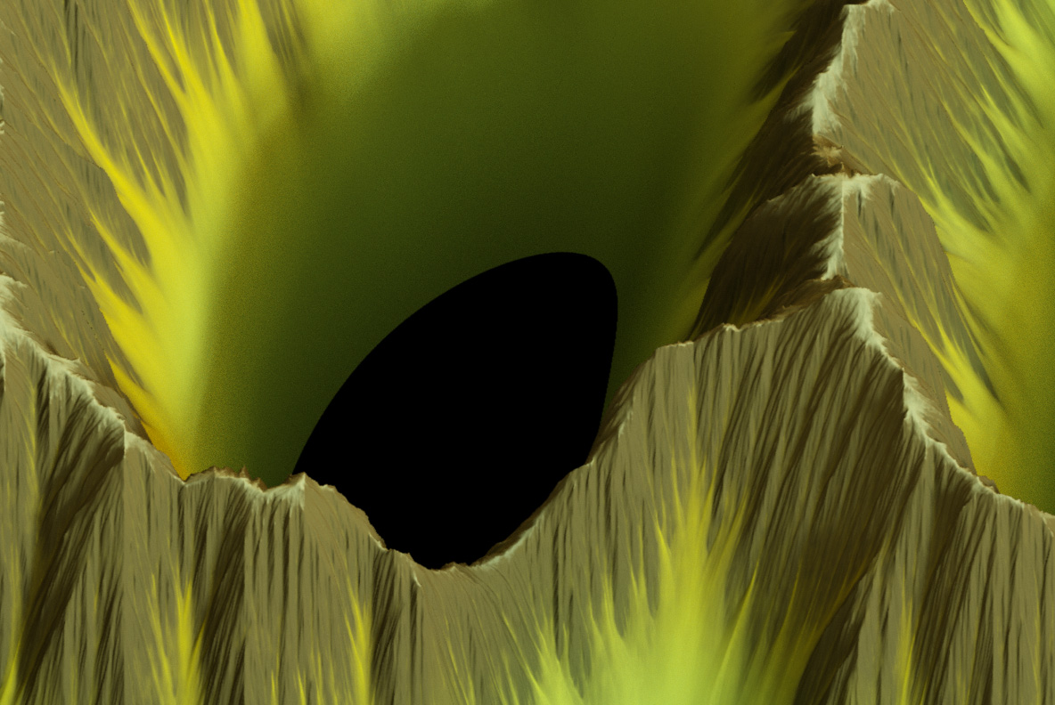
Naturally, every character here is a small island photographed from just above the waterline. Tops stay flat and grassy too, in a pale yellow-green that looks bleached by sun. Sides then drop away in eroded cliffs, streaked with vertical runoff grooves. Counters in B and O read as lagoons, complete with dark water inside. Because each letter is one continuous landmass, the alphabet never turns into scenery clutter.
The Island Font Shades Itself
Sunlit tops sit bright while the cliff faces fall into shadow, so words carry depth on flat colour. Also the palette holds at two tones, which keeps a long line calm. Meanwhile turquoise water behind it does more work than any drop shadow. So this one wants a photographic background rather than plain white. Of course that suits the subject matter perfectly.