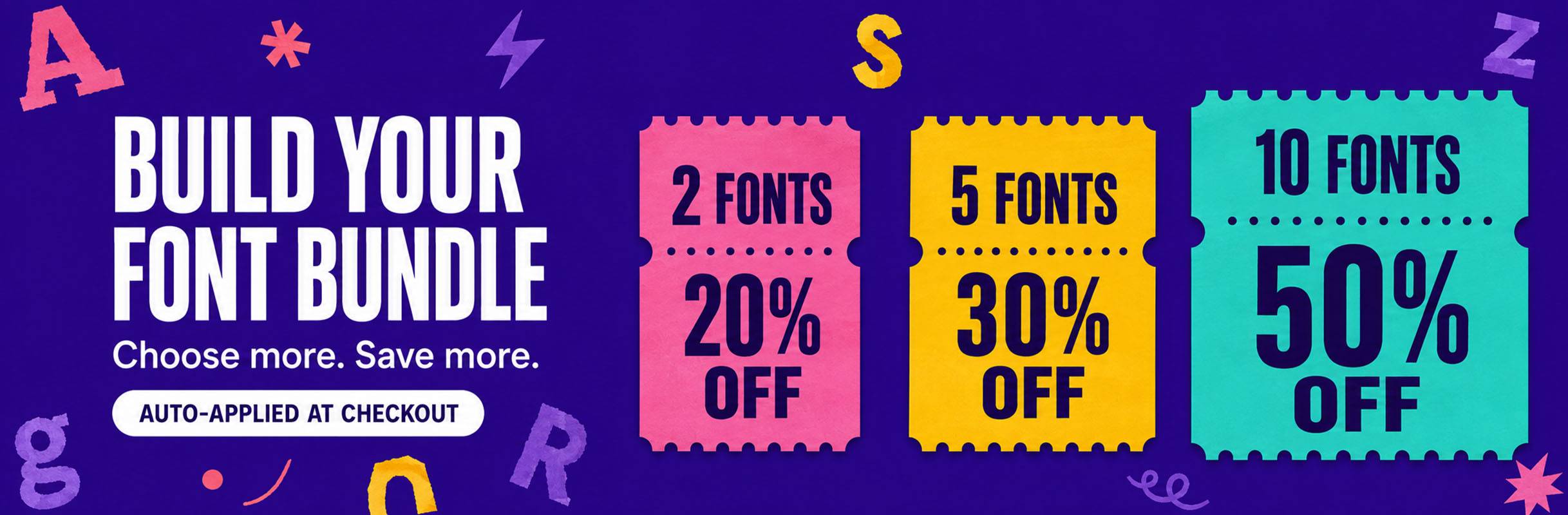
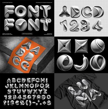
Aerochrome Font builds each capital from a hard geometric block, then lets the surface swell until every face reads as a cushion. The whole alphabet stays one matte grey with a fine suede grain, so top lighting and pooled shadow carry the depth. It arrives as an OTF you type with, plus separate PNG letters on transparent backgrounds.
Aerochrome Font Inflates a Square Into a Cushion
Every capital in Aerochrome Font starts as a hard geometric block, because the outline stays strictly angular. Then the surface swells, so each face bulges out like a cushion under pressure. Corners keep their right angles, though the fill between them rounds off completely. Counters press inward as well, where a dome or a dimple replaces the usual hole. Naturally the result reads as one solid object rather than a drawn letter.
One Grey, Lit From Above
The whole alphabet stays a single matte grey, since colour would fight the modelling. A fine suede grain covers it too, so the light never turns into a hard reflection. Top lighting does the rest, because the shadows pooling in the recesses carry all the depth. Move the light and the letter changes shape, of course, which is the whole trick. Above all, nothing here shines; this is chrome that went soft.