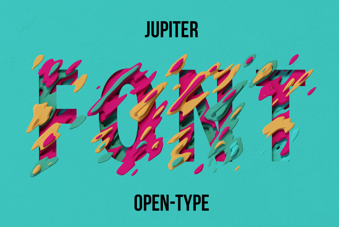
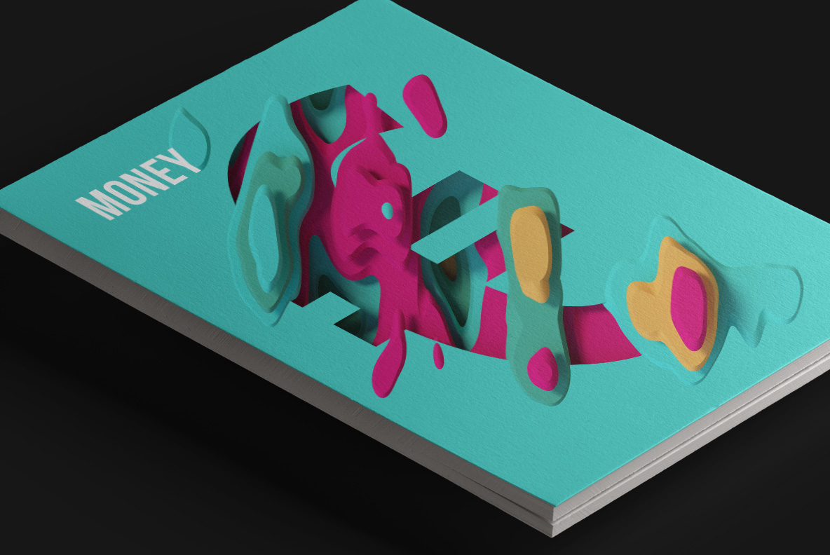
Layers of magenta, teal and ochre swirl through every letter like the cloud belts of a gas giant, spilling past the outline. The Jupiter Font is drawn on a condensed sans, so a headline still holds together. Mockups run from an acid yellow book cover to a folded poster. Supplied as an OTF plus transparent PNG letters.
Storm Bands Poured Into Letterforms
Of course, layers of liquid colour swirl through each letter like the cloud belts of a gas giant. Magenta, teal, ochre and black stack in flat bands, and every one casts a soft shadow on the next. Shapes spill past the letter edge in places, so the outline stays deliberately loose. Meanwhile the strokes underneath follow a condensed sans, which holds a word together. Because the pattern shifts per glyph, no two letters repeat.
The Jupiter Font Runs on Four Colours
Four colours and no outline at all, though, which is unusual for something this busy. So it reads best on flat ground, whether that is teal, yellow or plain black. Also the layered bands give real depth without any gradient work. Besides, the palette already carries its own contrast, so nothing else needs adding. Naturally that makes it a headline face rather than a body one.