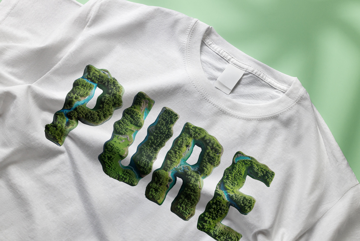
Look straight down at a forest and you get these letters. Each glyph is a slab of dense green canopy with a blue river cutting through it, seen from the height of a small plane. Roads, clearings and shallows show up if you look closely. It is the only alphabet here that works as landscape and as typography at once.
An Aerial View That Spells
Look straight down at a forest and you get these letters. Each glyph is a slab of dense green canopy with a blue river cutting through it, so the shape reads as terrain before it reads as type. Treetops sit at different heights, which gives the surface a real bumpiness. Since the water wanders differently through every character, no two letters share a course. Overall it behaves like an aerial photograph that happens to spell.
The NatureForm Font Is Built From Canopy
The NatureForm Font runs on a condensed bold sans, and that choice, of course, does the heavy lifting. Thick stems give the canopy room to look like canopy, while flat terminals keep the outline crisp against a background. Counters are small but never close up. Above all the green stays in one family, cool and slightly blue, so a headline does not turn into a patchwork. Naturally the river reads as the accent colour.