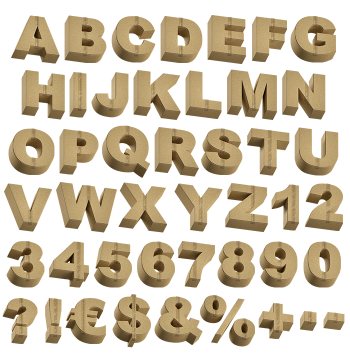
Heavy condensed capitals cut from flattened parcel boxes, with kraft grain, panel seams and strips of packing tape included. The Flat Pack Font covers letters, numbers and punctuation, and the thick strokes hold up from thumbnail to billboard. Mockups run to book covers, posters, a t-shirt and a building wrap. Supplied as an OTF plus transparent PNG letters.
Letters Cut Straight From Parcel Boxes
Flatten a stack of parcel boxes, then cut an alphabet out of the panels. Each capital is a heavy condensed slab in warm packing brown, and the kraft grain shows through. Seams run across the faces where box panels met, while pale strips of tape cross a few letters. Corners stay sharp, so the shapes read as cut card rather than moulded plastic. Look at the question mark and you will even spot a tiny shipping label.
The Flat Pack Font Trades Fuss for Weight
Weight is the point here, because the strokes run thick and the counters stay small. So a headline holds together at poster size and at thumbnail size alike. Also the brown sits comfortably on yellow, teal, black or plain white. Meanwhile the tape strips break up the fill, and that keeps the letters from going flat. The Flat Pack Font therefore works as a proper display workhorse, not only a gag.