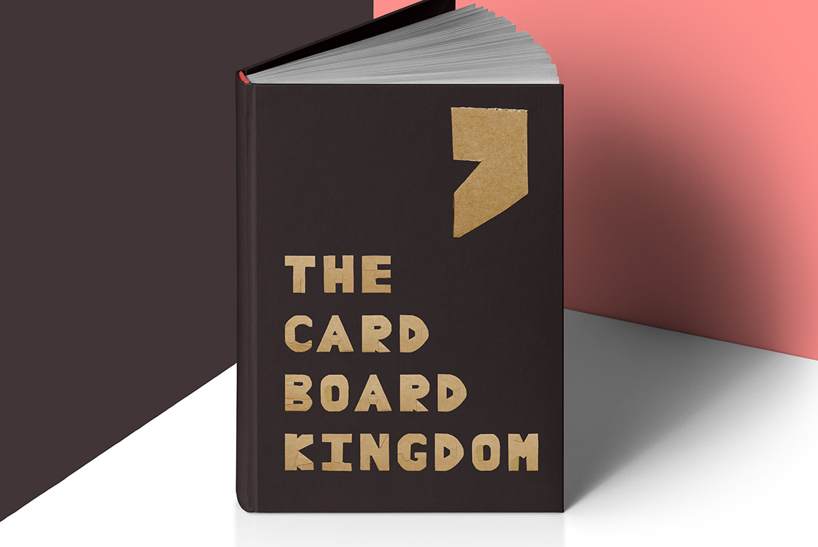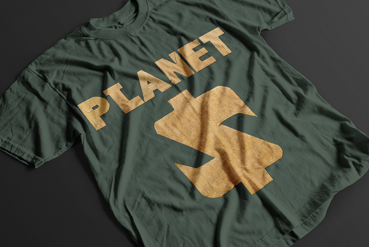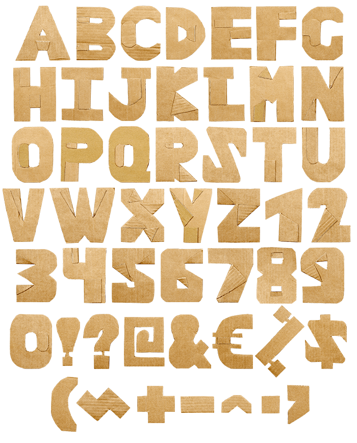

Heavy sans capitals cut by hand from a shipping box, edges wandering slightly and fluting showing wherever the liner tore. Kraft brown throughout, with no paint and no print. Repeated letters never match exactly, so words look made rather than set. Ideal for recycling campaigns, refill shops, moving companies and any brand that would rather look thrifty.
Scissors, Not Software
Somebody took a blade to a shipping box and stopped worrying about straight lines. Edges wander slightly, corners fray, and where the top liner tore away the fluting shows through as a row of small ridges. Kraft brown carries all of it, naturally. Nobody painted or printed that colour on; it is simply the board. Since light rakes across the surface, every ridge throws its own shadow. Even the currency signs keep a ragged corner or two.
The Cardboard Cut Font Up Close
Underneath the roughness sits a properly heavy sans. Strokes run broad and flat, so the Cardboard Cut Font stacks into headlines without gaps opening up. Counters stay wide too, which matters because a torn edge eats into them. Since the blade cut every glyph separately, repeated letters never match exactly. Words therefore look made by hand rather than set by a machine. Because nothing here is glossy, the letters stay calm on busy photography.