Stone Stack Font – Letters Built from Piled Field Stones

49.00$ 34.30$

Loose field stones balanced into letter shapes, seams and chipped corners left visible, lichen still on the flatter faces. A condensed slab skeleton under the rubble keeps the Stone Stack Font solid rather than crumbly, so headlines land with weight. Caps, numerals, punctuation and a stacked ampersand come along. Best on short lines: adventure branding, metal covers, anything meant to look old.

Don't forget about our exclusive deal!
  5 Fonts-30% OFF   🔥   10 Fonts-50% OFF  

Read more about licensing

Animation building a word letter by letter in the Stone Stack Font

Nobody Carved the Stone Stack Font

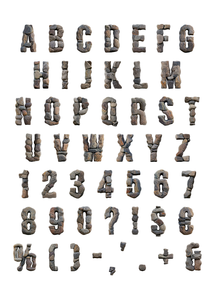
Each letter is a pile rather than a block. Separate field stones sit balanced on top of one another, so you can see every seam. Corners are chipped, faces are weathered, and lichen has got into the flatter ones. Nothing repeats, which means a word leans and settles slightly differently each time. It reads as built by hand, and that is the whole point. And the Stone Stack Font never looks extruded from one single shape.

Weight Without Losing the Word

A condensed slab skeleton hides under the rubble, which is why headlines stay solid. Gaps between stones never open far enough to break a stroke, though. Caps run A to Z, and numerals, punctuation and a stacked ampersand come with them. Texture faces often turn to gravel past the alphabet, yet this one holds. So type a full line and every character survives it. Shrink it to a logo mark and the seams still register.

What the Stone Stack Font Is Good For

Adventure and outdoor brands come to mind first. After that: metal covers, brewery labels, hiking gear and museum signage. It also survived a brick-wall billboard, a record sleeve and a white tee without complaint. Short lines still work best, because a wall of stone letters gets heavy fast. Neat cut courses suit you better than loose rubble? Then try the Stone Bricks Font instead. Besides that, more rock sits in the Stone Fonts collection.

It Reads as Old, Which Is the Point

Weathering, more than shape, does the talking here. Chipped edges and lichen suggest something that has stood outdoors for years, so the type carries age without any extra styling. Naturally that works for heritage brands, and equally against anything trying to look new. The package also holds an OTF you can type with, plus each character as a separate high-resolution PNG on a transparent background.

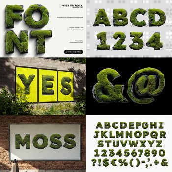
Stone Stack Font cover sheet spelling FONT with letters piled from grey rocks
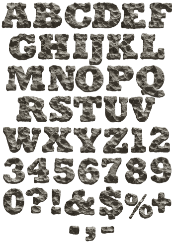
Full Stone Stack Font character set of rocky capitals, numerals and symbols
Black billboard on a brick wall spelling BOLD in the Stone Stack Font
White t-shirt printed with two stacked-rock words in the Stone Stack Font
Yellow poster with a three-line saying about stones set in the Stone Stack Font
Curled paper poster with a four-line stone saying set in the Stone Stack Font
At sign and percent symbol from the Stone Stack Font on a sage green background
Black vinyl record sleeve with a three-line title in the Stone Stack Font
Framed orange print of a single stacked-rock symbol from the Stone Stack Font
Stone Stack Font letters A to D and numbers 1 to 4 on a transparent background
Updating
  • No products in the cart.