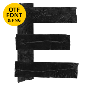
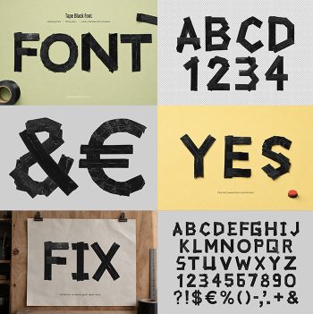
Capitals patched from short lengths of brown packing tape, laid at odd angles and torn rather than cut. The tape is semi-transparent, so overlaps darken and every letter ends up with its own internal map. It suits logistics and packaging branding, protest posters, zines, streetwear and record covers.
Torn strips, laid down in a hurry
Someone patched every letter together, naturally, from short lengths of packing tape. The strips run at different angles, and none of them line up neatly. Torn ends leave the edges ragged and fibrous, rather than clean. A bold condensed slab holds the shape underneath, so words stay legible. Even the counters, besides, use overlapping scraps. Because the patching differs on every glyph, repeated letters never match.
Brown that darkens where the tape overlaps
Tape is semi-transparent, of course, and the set makes full use of that. Where two strips cross, the brown doubles up and goes noticeably darker. Single layers stay light and almost golden, meanwhile, so each letter carries its own internal map. Small creases and air bubbles also catch the light. Look closely at the O, then, and you can count the layers.