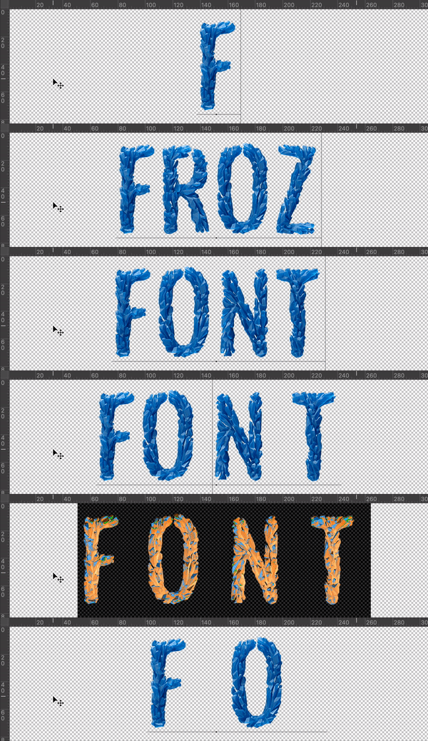
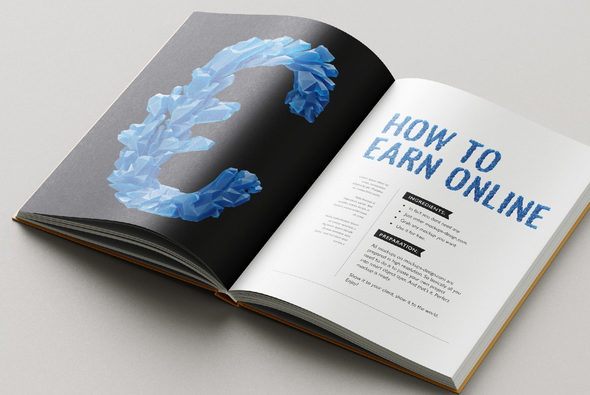
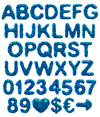
Bright cobalt ice broken into flat facets and stacked back into letters, with sharp points pushing past every outline. The Frozen King Font hides a narrow condensed sans under all that shattered ice, so headlines stay tight and readable. Numerals, currency signs and punctuation freeze the same way, and dark backgrounds make the blue glow.
Ice Broken, Then Rebuilt as Letters
In fact, someone took a frozen lake apart and stacked the pieces into an alphabet. Flat blue facets pile along every stroke, and sharp points push out past the outline. The blue runs bright and saturated too, closer to deep winter sky than to grey slush. Light catches the cut faces in hard flashes, so each letter reads as solid frozen mass. Because the shards sit at random angles, no two glyphs break the same way.
A Condensed Sans Under the Frozen King Font
Strip the ice away, of course, and the skeleton turns out narrow and businesslike. Strokes likewise stay even in weight, terminals cut flat, counters kept tight. That discipline matters, since the shards pile so much visual noise on top. Headlines therefore stay readable even when the ice spills everywhere. Numerals, currency signs and punctuation also freeze the same way. Besides, a condensed width lets long words fit a poster without shrinking.