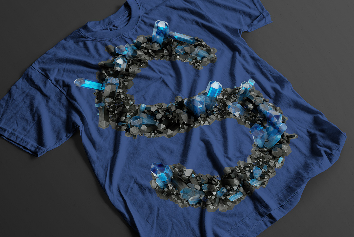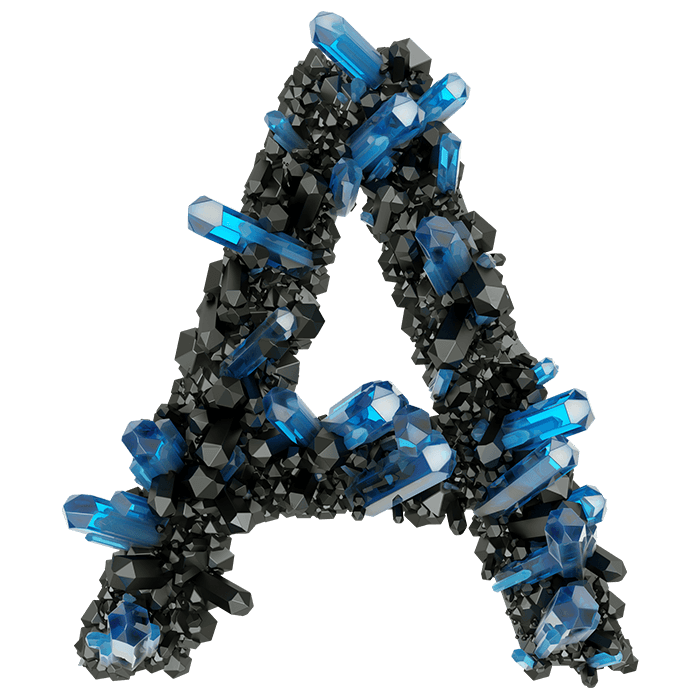
Blue mineral blades pushing out of dark grey rock, angled however they grew. The matrix crowds each stroke while the crystals break the outline, so no two letters carry the same weight. Cold, heavy and a little occult, built for wellness brands, tarot decks, mineral shops and album covers that want something dug up rather than drawn.
Mineral Seams That Grew Into Letters
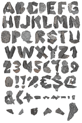
Look closely and there is no smooth surface anywhere, only crust. Dark grey matrix crowds the middle of every stroke, while blue blades push out of it at whatever angle they please. Some points sit flush, and others break the outline entirely. Because the growth stays uneven, no two glyphs carry the same weight. That unevenness is the whole appeal, of course. Nothing here looks carved; it looks grown. Even the punctuation seems quarried rather than drawn.
Inside the Crystal Field Font
Colour does most of the work here. Steel blue reads cold against near-black rock, so the Crystal Field Font glows a little on dark grounds and goes quiet on pale ones. Small white glints sit on the blade tips as well, which stops the cluster turning to mush at small sizes. Heavy, yes, though still readable. Since every letter keeps a firm sans skeleton underneath, whole words stay legible.