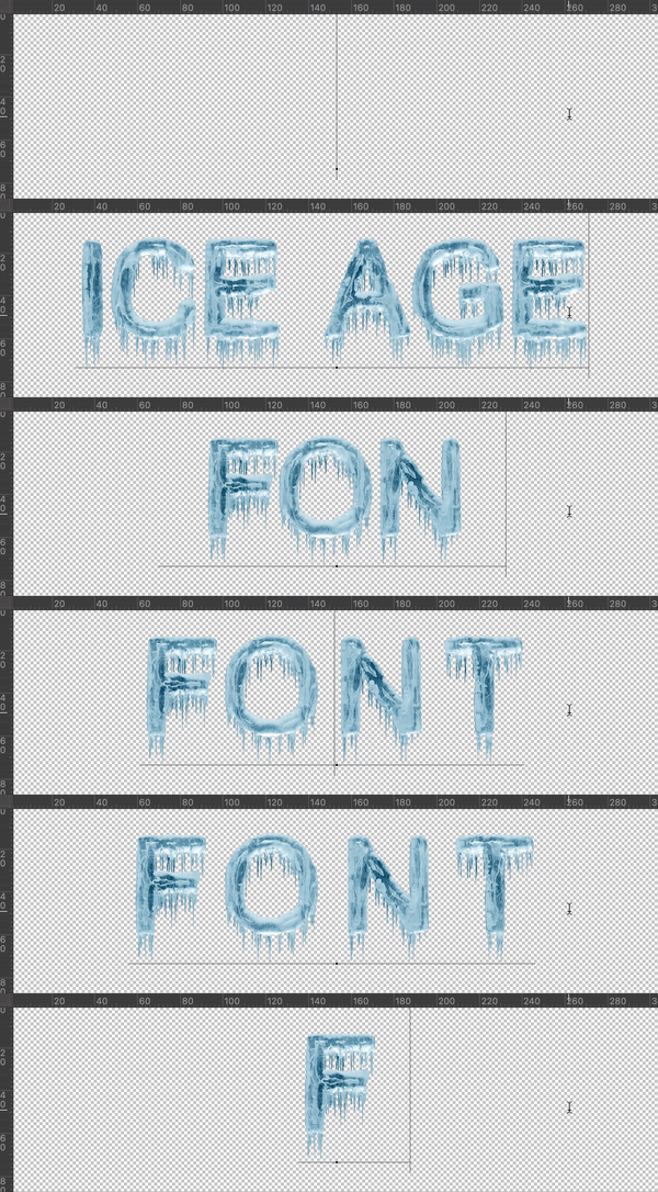
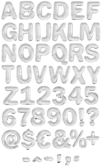
Solid cloudy ice letters, pale blue with white bloom, and an uneven fringe of icicles hanging off every lower edge. The Ice Age Font is drawn on a plain condensed sans, so words stay readable at any size. Mockups run from a hot pink poster to a black book cover. Supplied as an OTF plus transparent PNG letters.
Frozen Solid, Then Left to Drip
These letters froze first and dripped afterwards, which is really the whole trick. The body of each glyph is solid cloudy ice, pale blue with white bloom inside. Along every lower edge, icicles hang down in an uneven fringe. Because that fringe varies letter by letter, a word gets a ragged baseline instead of a ruled one. The shapes themselves stay a plain condensed sans, so nothing gets lost.
Two Blues and a Lot of Contrast
Colour stays limited to two blues plus white, and that is deliberate. So the letters read cold instantly, before anyone processes the actual word. Also they sit beautifully on black, where the icicles glow against the dark. Meanwhile on warm colours like pink or orange the contrast turns almost neon. Naturally this one does its best work on strong flat backgrounds.