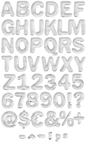
Ice sawn into flat-faced blocks, then left long enough for the corners to round off and the faces to frost over. Underneath the milky scuff sits a bold geometric sans, so words stay readable. There are no cracks and no icicles here. Use it for winter campaigns, drinks packaging or anything that should feel refrigerated.
Cut From a Block, Not Grown From a Drip
Most ice alphabets reach for spikes and cracks, of course. This one went to the ice house instead. Each letter is a flat-faced block, sawn square and then frosted over. The faces look scuffed and milky, while the edges have rounded off just enough to seem thawed. Besides, the counters keep their sharp inner corners. Naturally the gleam sits on those edges, so the letters read cold without shouting about it.
The Clean Ice Font Keeps Its Corners
Underneath the frost, in fact, the skeleton is a bold geometric sans. Because the shapes stay simple, whole words hold up at small sizes. Tiny air bubbles and drag marks cross every face, so no two letters frost alike. Figures and punctuation likewise match the capitals exactly. Above all, nothing here is broken. Cracks, spikes and icicles belong to other alphabets, while the Clean Ice Font stays intact.