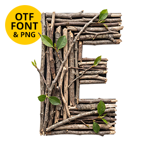
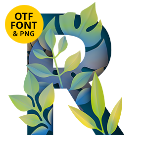
Fronds folded over each other until they hold the shape of a letter, veins running across the strokes instead of along them. The Tropical Leaves Font puts that greenery on a chunky condensed frame, which is why a headline stays compact and loud. Caps, numerals, brackets and punctuation are all here. Made for summer campaigns, eco branding and anything that should look alive.
What the Tropical Leaves Font Is Actually Made Of
Broad banana and palm fronds, folded over each other until they hold a letter shape. Veins run right across the strokes rather than following them, so the eye reads plant before it reads type. Edges curl and catch light exactly where a real leaf would curl. Some blades overlap too, which drops shadow inside the counters. None of it is a leaf-shaped outline with green fill. And that is why it survives being blown up to poster size.
Loud Enough for a Headline
The skeleton beneath the greenery is a chunky condensed sans. Because it is condensed, long words stay compact instead of sprawling. Caps cover A to Z, while numerals, brackets, currency and punctuation come alongside. Even the percent sign got its own leaves. Botanical typefaces usually run out of steam after the alphabet, yet this one does not. So type a whole sentence and every character shows up.