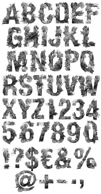
Deep teal letters with tropical leaves layered over and behind them, all cut from flat paper. Monstera, fern and eucalyptus shapes overlap in soft green and yellow gradients, some in front of the letter and some tucked behind. It is illustration as much as type, which is the reason people buy it in the first place.
Leaves Cut From Flat Paper
Every letter is a dark teal slab with foliage growing across it. Monstera, fern and eucalyptus shapes sit in front of the stroke and behind it, so the eye reads depth even though nothing here is photographed. The greens run as soft gradients from lime to sage, while the letter itself stays flat and cool. Because the leaves break the outline, no character looks boxed in. Naturally the palette holds together across a whole word.
The Paper-Jungle Font Layers Its Depth
The Paper-Jungle Font builds depth in layers rather than shadows. A leaf in front of a stem is simply a lighter shape laid over a darker one, which is exactly how a paper collage works. Counters stay open, since the foliage never fills them. Above all the letterform is a sturdy bold sans, so a headline survives all that decoration. Some glyphs carry more leaves than others, though.