Baroque, but make it letters! This Bas-relief Font isn’t just typography—it’s an architectural masterpiece in every character. Sculpted, ornate, and drenched in vintage elegance, it whispers filigree-filled secrets from a bygone era. Think classical engravings met a fancy chisel. Luxurious? Absolutely. Over-the-top? Delightfully so. Your words just got a sculptural glow-up!
Baroque? More Like Ba-ROCK—This Font Is Chiseled Perfection.
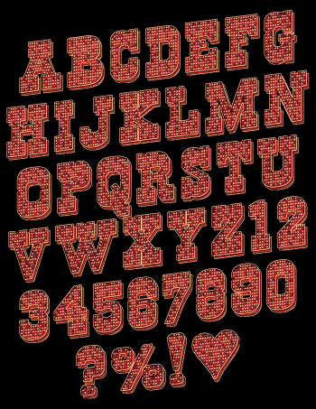
Imagine if Michelangelo had traded his chisels for a keyboard—he might have invented the Bas-relief Font. This isn’t just a font; it’s an ornate, sculpted masterpiece trapped inside your screen, longing to escape into the world of fine art. Each letter is a miniature architectural wonder, as if plucked straight from the façade of a grand baroque palace or an ancient cathedral where cherubs whisper in Latin and everything smells faintly of old books and candle wax. This Bas-relief alphabet isn’t just designed; it’s practically carved, its luxurious, embossed elegance giving each character the appearance of a finely sculpted stone relic, kissed by time but untouched by dust.
With swirling floral patterns and intricate filigree, this Bas-relief typography looks like it was engraved by a master artisan who probably had very dramatic hair and wore a velvet coat while sighing deeply about the nature of beauty. It’s the kind of font that doesn’t just make an impression—it leaves an entire architectural legacy in its wake. This is lettering that would make a 17th-century engraver weep into his quill, muttering something poetic in French.