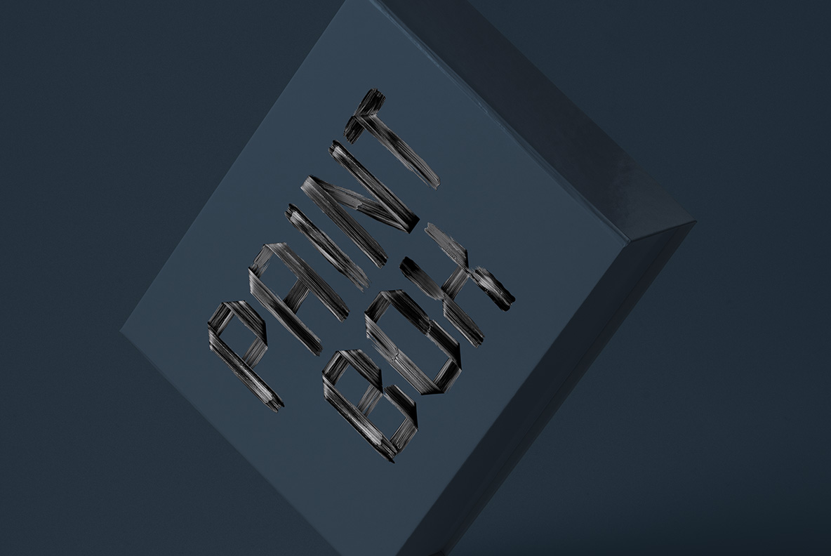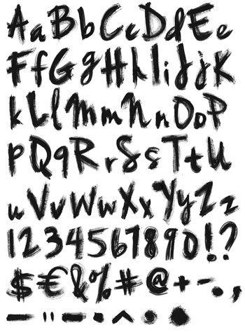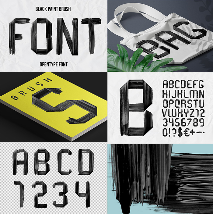

The bristles left a record of themselves. Black Paint Brush Font drags a flat brush in one direction, so long parallel grooves run the length of every stroke and each letter finishes on a hard square edge. The forms come out angular and constructed. It suits magazines, catalogues, lookbooks and film titles, and it types from a plain OTF with transparent PNG letters.
Black Paint Brush Font Shows Every Bristle
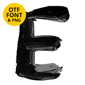
The bristles left a record of themselves. Each stroke in the Black Paint Brush Font is a flat brush dragged in one direction, so long parallel grooves run the whole length of it. Because a flat brush ends square, the letters finish on hard flat edges rather than points. The letterforms come out angular and constructed, closer to a stencil than to handwriting. Meanwhile the grooves let the ground show through in thin stripes. Naturally the black reads as dry rather than wet.
Flat Ends and Straight Ribbons
Every glyph is assembled from ribbons. The strokes keep a constant width, since a flat brush held at one angle cannot swell. Where two ribbons meet, the join stays visible as an overlap rather than a blend. Besides that, the corners sit at real angles, some of them noticeably off ninety degrees. That slight tilt keeps the set from looking mechanical. Of course the striping varies from letter to letter, because no two drags load the same.