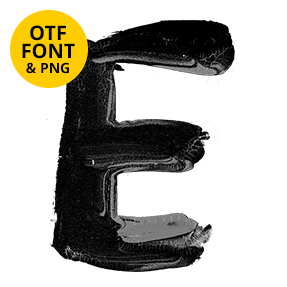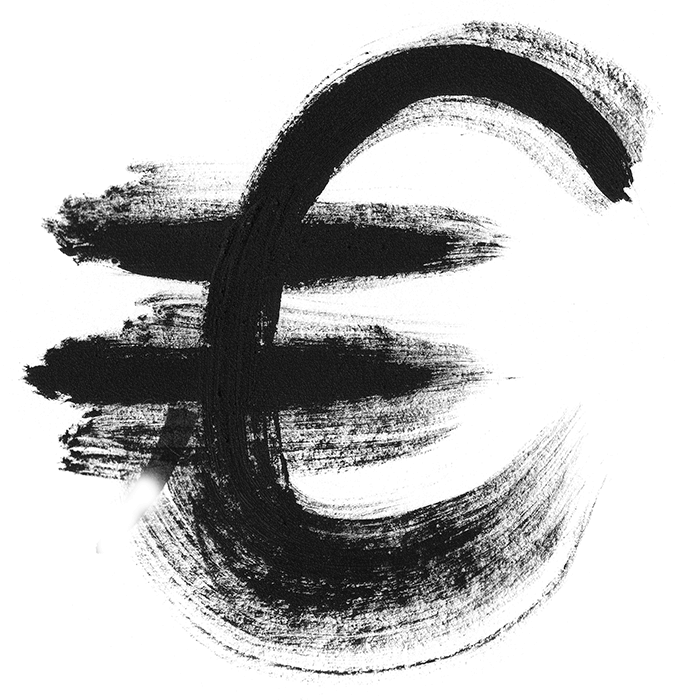
Black paint on a nearly dry brush, dragged fast enough that the bristles split and leave gaps. Every stroke shows the grain of the hair that made it. Upper and lower case both come drawn by hand, so words can be set the way somebody would actually write them. It reads urgent rather than decorative, which is the useful part.
A Brush With Almost No Paint Left
Load a brush, wipe most of it off, then move fast. That is what every stroke here records: split bristles, gaps down the middle of thick strokes, and tails that fade out instead of stopping. The black is flat and matte, with no gloss and no drips, so the letters read as ink rather than as poured paint. Because the pressure varies, stems swell and thin along their length.
The Oil Brush Font Has a Full Lowercase
Most brush alphabets give you capitals and leave it there. The Oil Brush Font draws a full lowercase as well, which means you can set a real sentence rather than a slogan. Letterforms lean slightly forward and join where a hand would join them. Ascenders overshoot, descenders hook, and the baseline wanders on purpose. Naturally no two versions of a letter match, since each one was painted once and kept.