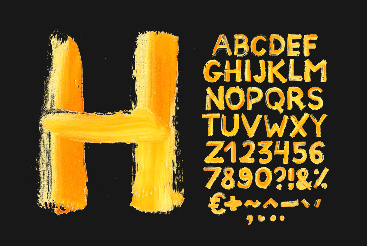
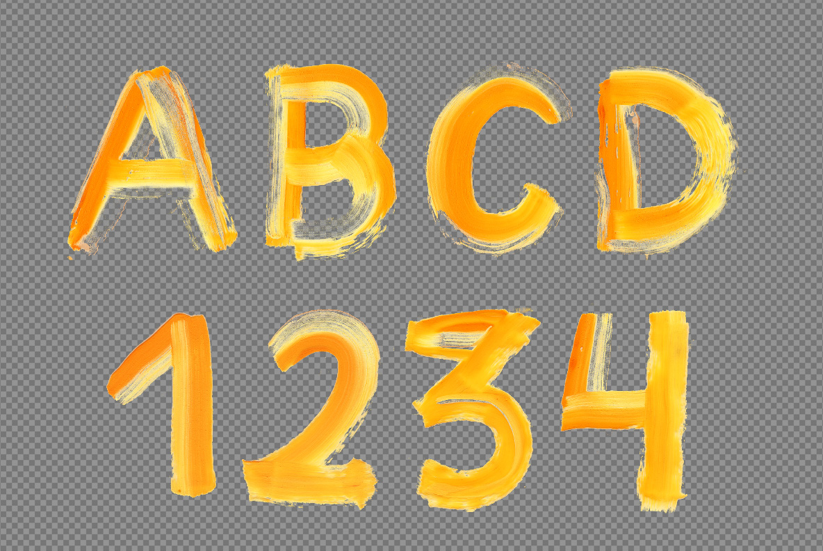
Somebody went at the alphabet with a loaded brush. Brush Paint Font lays every letter down in one golden-amber motion, thick where the bristles pressed and broken into dry streaks where the paint ran out. It suits art schools, paint brands, festival posters and craft packaging. The set types from a plain OTF and includes transparent PNG letters.
Brush Paint Font Works in Warm Amber
Somebody went at the alphabet with a loaded brush. Every letter in the Brush Paint Font is a golden-amber stroke laid down in one motion, so the pressure shows along its length. Because the bristles ran short of paint near the ends, thin dry streaks open up there. The colour sits between marigold and honey, warm rather than acidic. Meanwhile the edges stay ragged, never cleaned up afterwards. Naturally the letterforms lean slightly, the way handwriting does when the hand is moving.
Dry Streaks and Loaded Sweeps
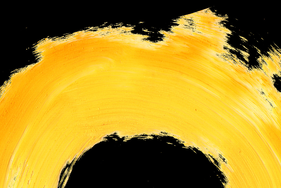
Two textures share every glyph. Where the brush pressed hardest, the paint pools thick and almost opaque. Since the pressure eased at the tail of each stroke, the coverage breaks into fine parallel lines. That contrast gives the letters their speed. Besides that, some strokes overlap and leave a darker patch where the layers met. Of course the paint never drips, because acrylic this thick holds its shape.