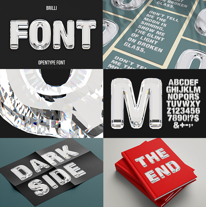
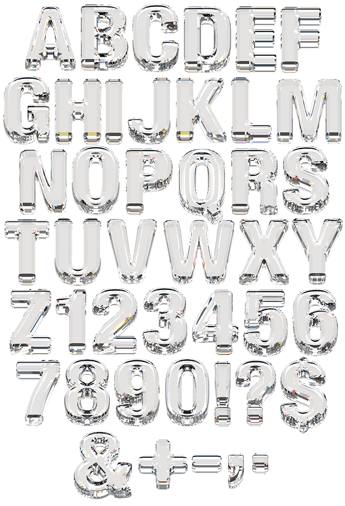
Cut crystal was never meant to spell anything. Brilli Font gives every glyph a jeweller treatment, with flat facets meeting along crisp ridges, hard white highlights on each edge and the background bending into slivers behind the glass. It suits fragrance boxes, watch campaigns, spirits labels and awards branding. The set types from a plain OTF and brings transparent PNG letters.
Brilli Font Cuts Its Letters Like Gemstones
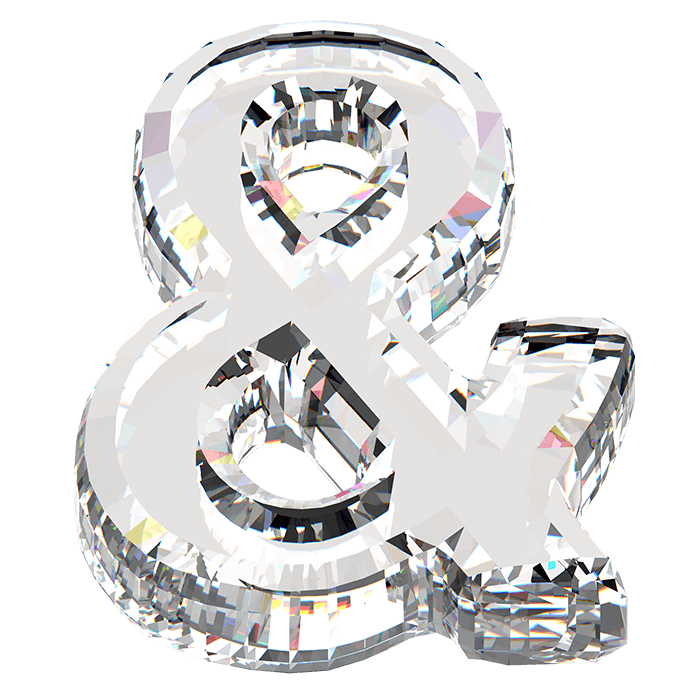
Cut crystal was never meant to spell anything. The Brilli Font gives every glyph the treatment a jeweller gives a stone, so flat facets meet along crisp ridges across each stroke. Because the glass is genuinely clear, you can see straight through a letter to whatever sits behind it. Then the facets bend that view into slivers. Meanwhile the ridges catch hard white highlights wherever two planes meet. Naturally faint rainbows appear along the thickest edges.
Clear Glass, Sharp Facets
Refraction does all the decorating. Light entering one face leaves through another, since the angles are steep enough to bend it twice. The result is a bright core with dark outlines rather than the reverse. Besides that, the base of each letter sits on a broader cut, the way a real crystal object would. Small chips of colour appear where the glass thickens. Of course the effect depends entirely on what sits behind the type.