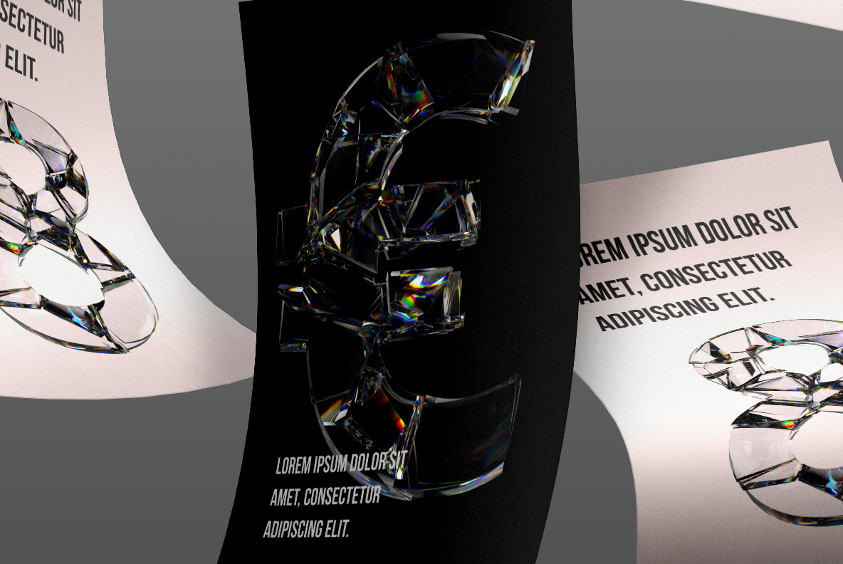
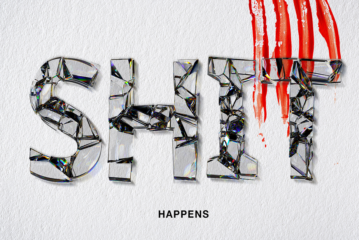
Clear letters assembled from large flat panes of plate glass that cracked apart and stayed roughly in place, with a thin rainbow running along every broken edge. The Fragility Font keeps a light geometric sans underneath, so the shape survives the damage. Colourless glass means the type takes on whatever sits behind it.
Plate Glass, Dropped Once
Each letter is built from big flat panes that cracked apart and then stayed roughly in place. The pieces are clear rather than frosted, so whatever lies behind them shows straight through. Along every broken edge a thin rainbow appears, the way real glass splits light. Of course, the reflections do half the work. Because the shards are large, the letterform survives the damage, and the Fragility Font leaves every crack exactly where it fell. Nothing here is powdered or crushed.
The Fragility Font Keeps Clean Shapes and Sharp Edges
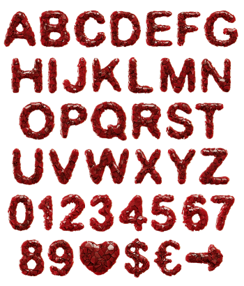
The skeleton is a light geometric sans, almost delicate before the breakage. Thin strokes and open counters let the cracks show without clogging the shape. Since the glass is colourless, the type takes on whatever ground it sits over. On black it turns silver, while on white it nearly disappears. Besides, the light strokes keep long words from turning into a wall. In addition, tiny fragments float free of a few glyphs. Figures, currency signs and punctuation shatter in the same style.