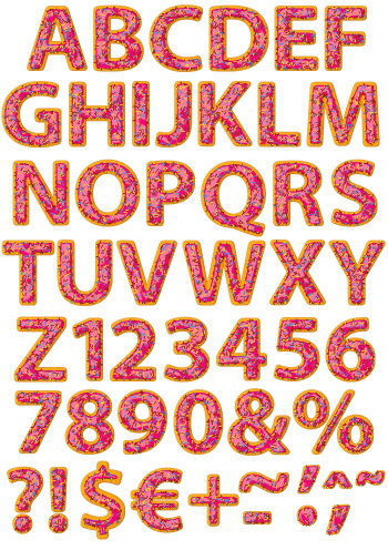
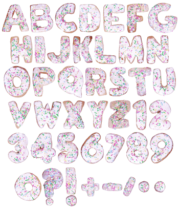
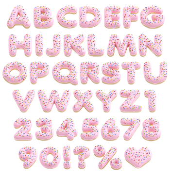
Fried dough, pink glaze and a chocolate drizzle, in that order. The glaze stops partway down each letter in a wavy line, so the golden dough underneath stays visible. Thin dark ribbons cross the pink at an angle. Everything is round, glossy and heavier than it needs to be. No sprinkles anywhere.
Three Layers, All Visible
Three layers, and you can see all of them. Golden fried dough forms the body of every letter, then pink glaze pours over the top. That glaze stops in a wavy line partway down, so the dough shows underneath like a rolled-up sleeve. Thin raised ribbons of dark chocolate zigzag across the pink as well. The Glazed Pink Donut Font keeps all three finishes distinct, because each one reflects light its own way. No sprinkles turn up anywhere, obviously.
Round Where It Counts
Doughnuts are round, so the Glazed Pink Donut Font went round with them. Bowls swell while terminals finish in soft domes, and nothing comes to a point. The O is a complete ring with a proper hole, of course. Thickness stays generous throughout, since a thin stroke could not hold three layers. Highlights sit high on every curve, therefore the glaze reads as genuinely wet.