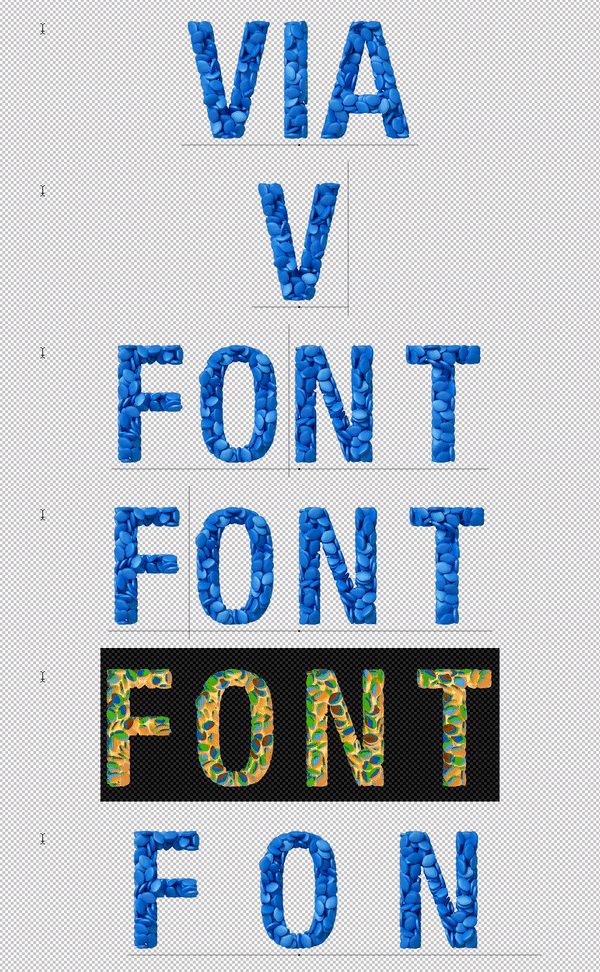
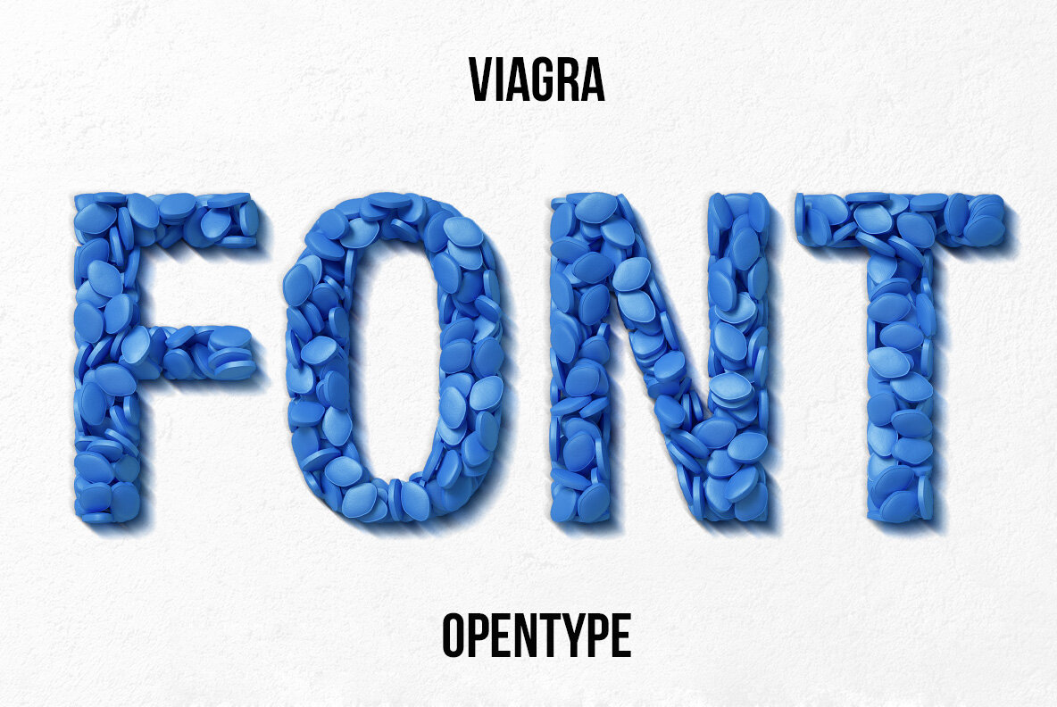
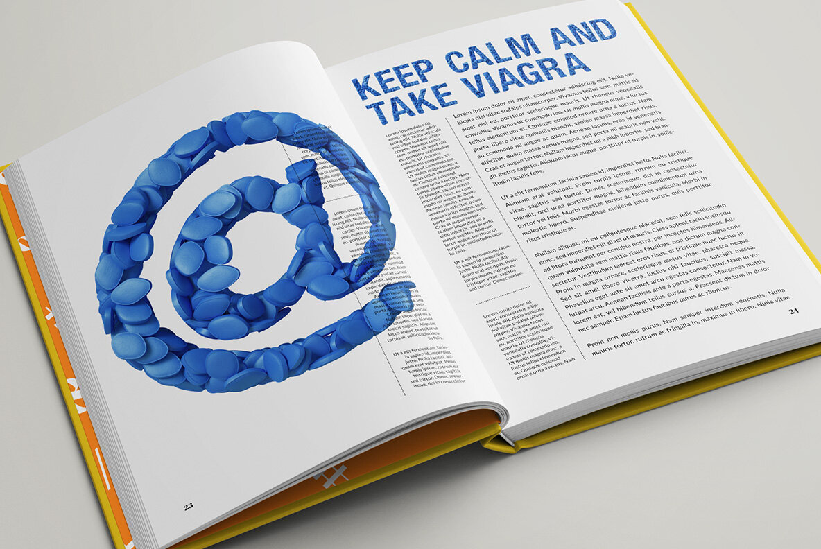
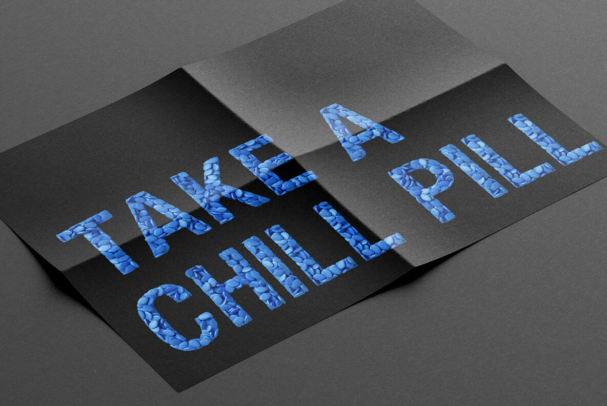
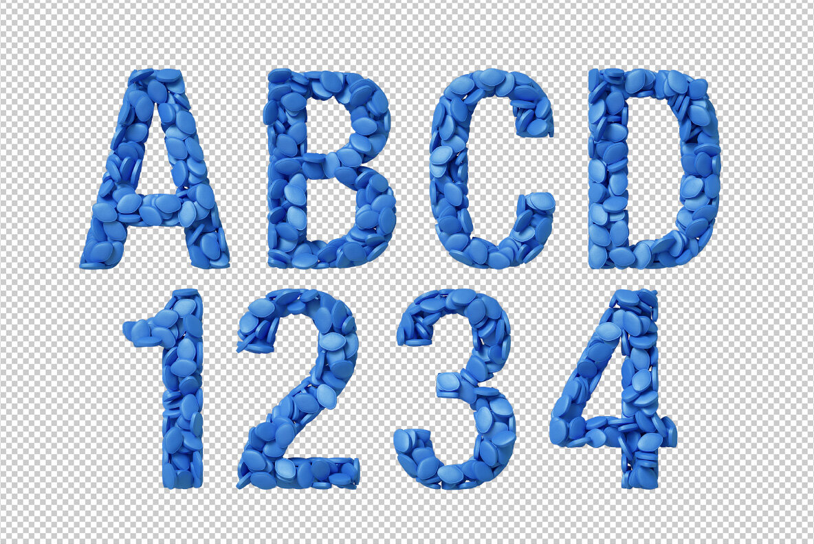
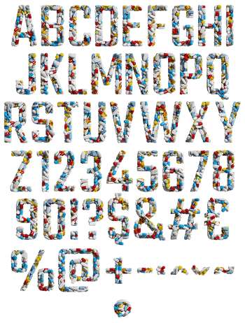
A bold condensed alphabet packed edge to edge with small blue tablets, each one sitting at its own angle. The surface stays chalky rather than glossy, so the letters read as real objects instead of flat colour. It fits editorial spreads, music covers, satirical posters and any layout that wants one loud recognisable blue.
One blue tablet, repeated a thousand times
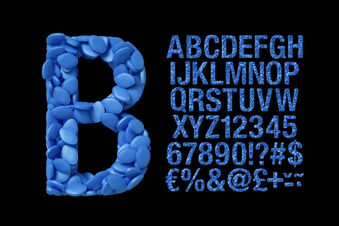
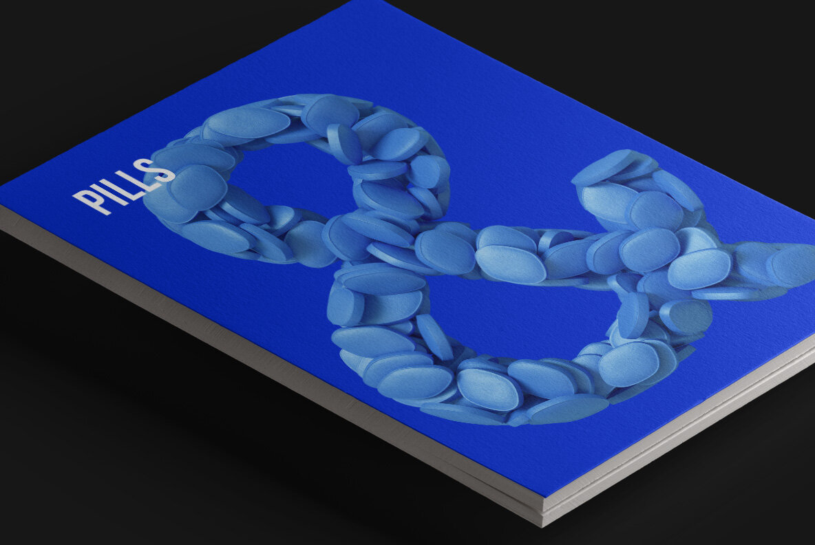
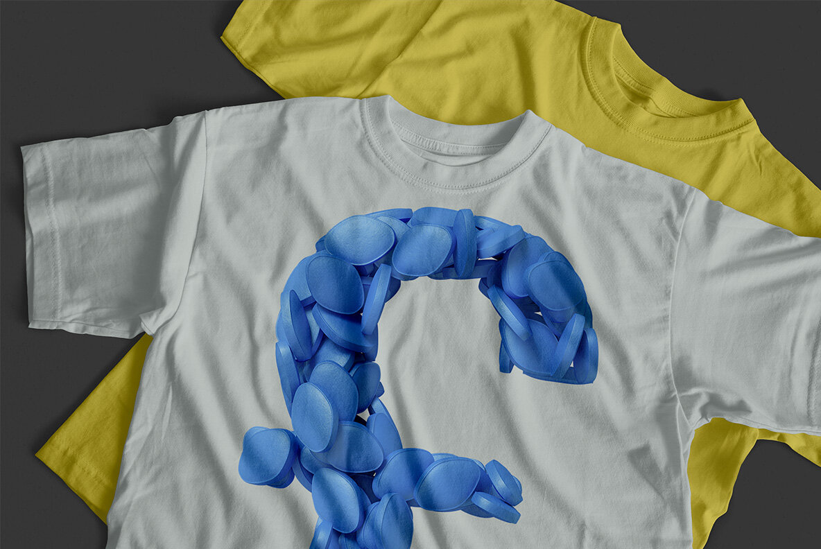
Every character is stuffed with the same small blue lozenge. The tablets sit at every angle, so edges, faces and rounded corners all show at once. Their surface stays chalky rather than shiny, which also keeps the blue from going plastic. Shadows fall between them, and that gap is what draws the letter shape. Because the pile is loose, a few tablets spill past the outline. Even the ampersand, meanwhile, keeps the same packing.
A condensed grotesque under all that blue
Underneath the clutter, of course, sits a bold condensed sans. The strokes stay wide and the counters stay open, so words hold together at small sizes. Numerals, currency signs and punctuation follow the same build too. Nothing is skewed or distorted to fit. On white the letters read as texture, while on black they glow like neon. At close range, though, the illusion breaks and you simply see tablets.