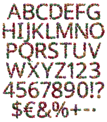
Letters packed with capsules and tablets in red, blue, yellow and white. Half-and-half capsules sit next to round pills and flat caplets, all glossy enough to look freshly tipped from a box. The colour mix is what does the work here. From a distance the letters read almost as confetti, which is the joke.
A Handful of Everything
Open the box and everything falls out at once. Two-tone capsules, round tablets and flat caplets pack the letters at every angle, in red, cobalt, yellow, orange and white. The surfaces are glossy, so each piece catches its own small highlight. Because the colours alternate constantly, the eye reads texture before it reads type. Since the pile is dense, almost no background shows through. Naturally a few pieces break past the outline.
The Pills Font Runs on Colour
Colour is doing the heavy lifting, which makes the Pills Font louder than its white sibling. Red and cobalt dominate, while yellow and orange fill the gaps and white keeps it from turning garish. That mix reads cheerful at a distance and clinical up close. Above all the letterform underneath stays a solid bold sans, so a headline still holds. Besides, the variety means no glyph repeats.