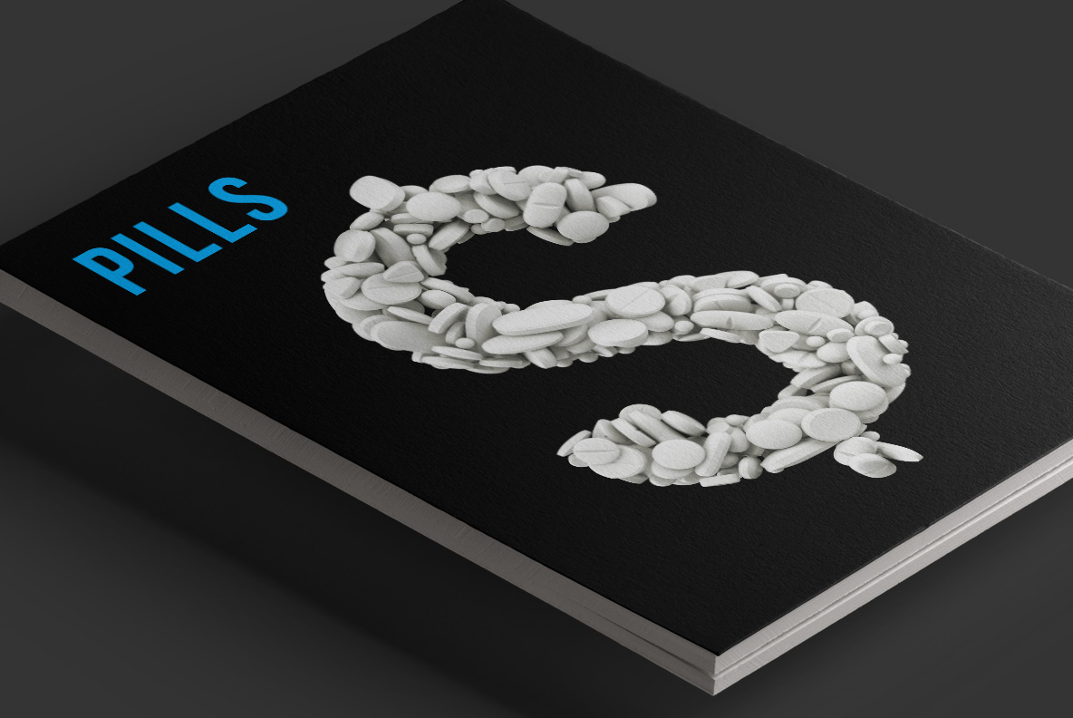
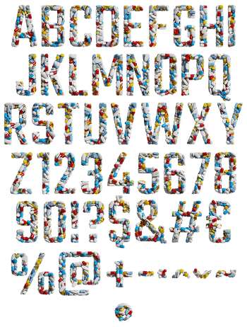
Letters packed solid with white tablets and capsules. Round ones, oval ones, scored ones and a few smooth caplets all pile together until the shape holds. Everything is matte pharmacy white, lit softly enough to read the individual edges. It is a clinical alphabet, and it works best when the subject is already serious.
Every Letter Is a Handful
Each character is filled with tablets, rather than outlined by them. Round pills, ovals, scored halves and smooth caplets pack in at every angle, overlapping where a stroke thickens and thinning out at the ends. Because they are all the same matte white, the shape survives despite the clutter. Soft lighting picks out the edges, so you can count individual pills rather than seeing a texture. Naturally the letterform underneath stays a heavy sans.
The Pills White Font Keeps One Colour
Sticking to one colour, above all, is what makes the Pills White Font usable. Anything multicoloured turns into confetti at a distance, while plain white holds its silhouette across a room. The shadows between pills do all the modelling, since there is no hue to help. Overall the alphabet reads clinical rather than cheerful, which suits the subjects that actually need it. Besides, white drops onto any background colour without a fight.