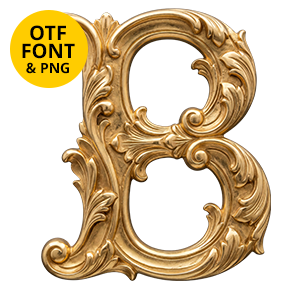
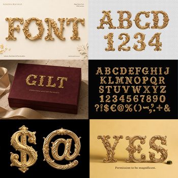
Solid brass capitals with bevelled faces running down every stroke, catching light on one side and falling into shadow on the other. The Golden Rome Font carries proper classical proportions, thick on the stems and thin at the joins, with no ornament anywhere. Figures, currency signs and punctuation are cast the same way.
Cast, Bevelled and Left Alone
Above all, there is no ornament anywhere in this alphabet. Each capital is likewise a solid piece of brass with bevelled faces running down every stroke. Those bevels catch light on one side and fall into shadow on the other, which is the whole effect. The metal stays satin rather than mirror, so it holds a soft glow instead of reflecting a room. Because the casting looks real, the letters sit like objects on a wall. Faint tool marks cross the flats too, which stops the metal looking synthetic.
Roman Proportions Doing the Work
The drawing underneath, of course, is properly classical. Stroke weights also vary the way carved Roman capitals do, thick on the stems and thin at the joins. Proportions stay wide and generous too, since narrow letters would lose the bevel entirely. That restraint therefore makes the Golden Rome Font feel expensive rather than flashy. Besides, figures, currency signs and punctuation follow the same casting.