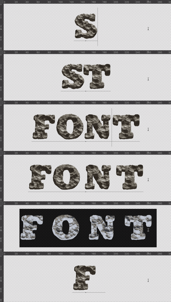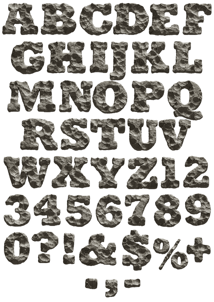

Rock Font builds every letter as a smooth, chunky boulder — no sharp edges, just soft rock facets stacked into solid gray letterforms. It reads as tough and permanent without tipping into cartoonish, which makes it a natural fit for gym branding, outdoor gear, and any logo that wants to look unbreakable.
A Chunky Boulder Alphabet
Every letter here is built as a smooth, chunky boulder, rendered digitally rather than carved by hand or photographed from a real quarry. Flat rock facets stack together to form each shape, with soft shadows falling into every crack and dent. Because the surface stays uniform gray from A to Z, the whole alphabet reads as one solid block of stone rather than a patchwork of different rocks. So even a short word ends up looking like it was excavated in one piece.
Where Rock Font Holds Its Ground
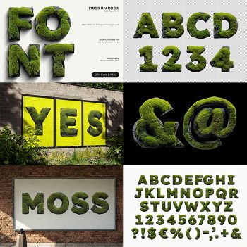
This one’s built for gym branding, outdoor gear, and any logo that wants to look like it could survive a landslide. It also works well on a band poster, a construction-themed title, or a t-shirt that leans hard into “built tough.” Because the letterforms stay bold and chunky even at small sizes, you can drop the alphabet onto a badge or blow it up across a billboard. Either way, it reads as solid and permanent.