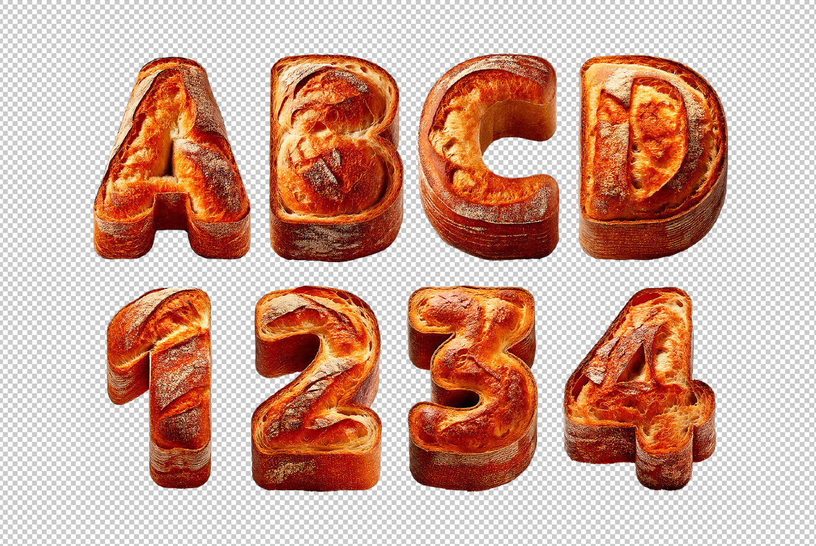
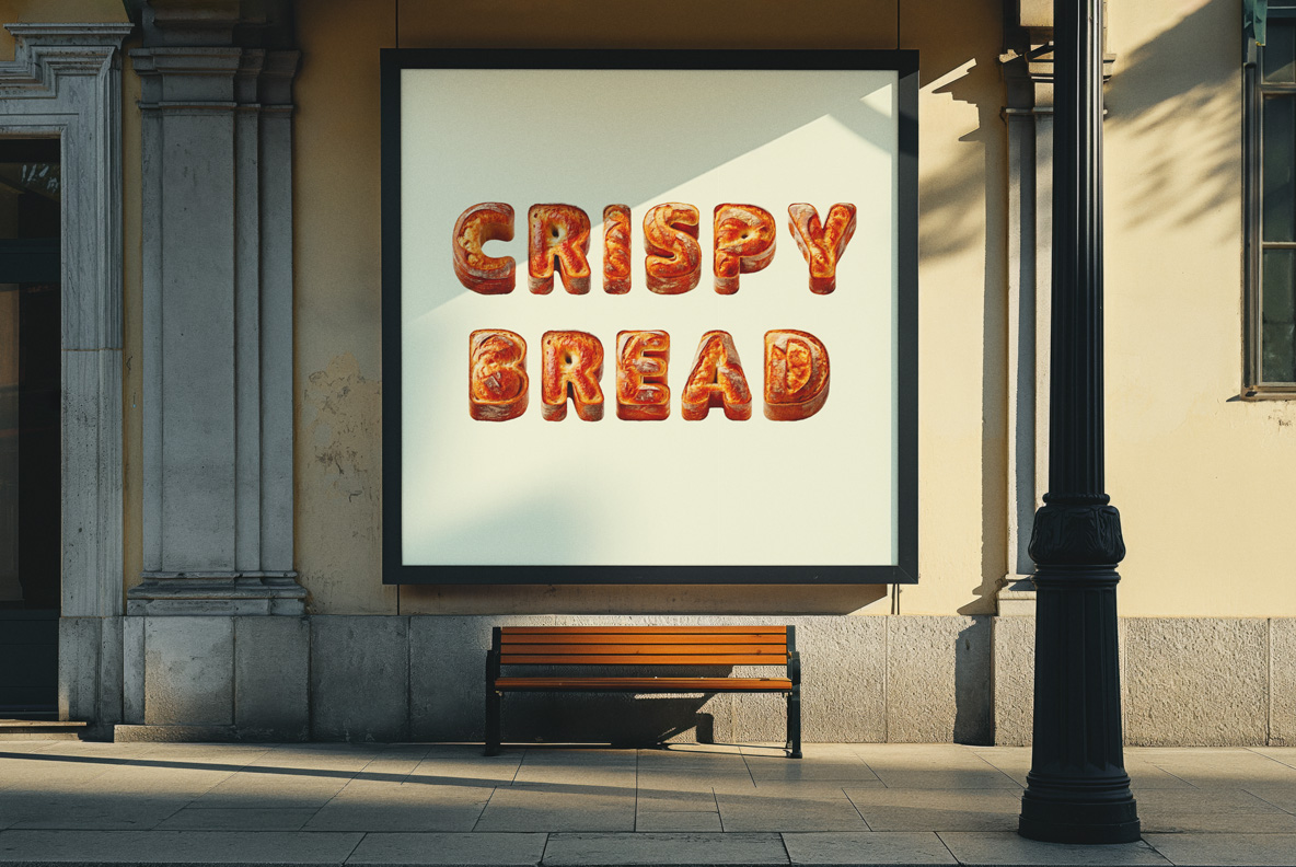
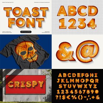
Crispy Bread Font bakes a wide geometric sans into loaf form, then lets the crust tear open along every stroke. Pale crumb and a dusting of flour show through the split, while the rest stays glossy and deep amber. Terminals cut flat, so words hold their line instead of sagging into a heap of rolls.
Where the Crust Splits Open
Every letter in the Crispy Bread Font carries one long tear down its face. Pale crumb shows through the gap, and flour has settled into the split. Bakers call that oven spring, so the shape reads as real bread rather than a drawing. Meanwhile the rest of the crust stays glossy and deep amber, almost lacquered. Because the tear wanders differently on each glyph, no two letters repeat.
A Plain Sans Hides Under the Crispy Bread Font
Strip the bake away and a wide geometric sans stays behind. Strokes hold one weight throughout, while the terminals cut flat instead of tapering. That discipline is why whole words in the Crispy Bread Font still line up. Naturally the counters stay open, since dough would otherwise swallow the O and the R. Above all, the spacing survives, so a headline never collapses into a pile of rolls.