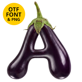
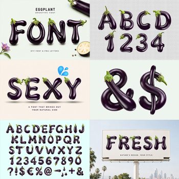
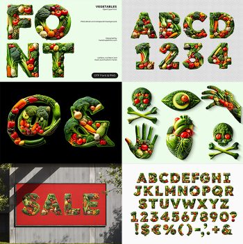
Cucumbers Font draws every stroke with a single whole cucumber, bent and stood on end. Dark waxy skin, pale ridges and small bumps keep the surface honest, while blunt cut ends finish each terminal. The strokes stay thin and slightly crooked, so a full sentence fits on one line without turning into a salad.
One Cucumber Per Stroke
Every stroke in the Cucumbers Font is a single cucumber, bent and stood on end. The skin stays dark and waxy, while pale ridges run the whole length. Small bumps break the highlight, so the surface never reads as smooth plastic. Blunt cut ends finish the terminals too, and the knife mark is still visible. Seeds never show either, since these are whole fruit rather than slices. Naturally the green shifts from deep bottle to bright lime wherever the shape turns.
The Cucumbers Font Wobbles on Purpose
Nobody grows a straight letter, and no grower tries. Because of that, the Cucumbers Font keeps a slight lean and an uneven baseline. Strokes stay thin and consistent in weight, so a full sentence still fits on one line. The counters run wide as well, which keeps the O and the G open. Above all, nothing here looks machined.