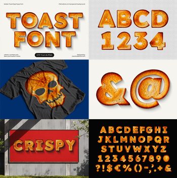
These letters came out of an oven. Bold Bread Font shapes a braided loaf into every glyph, with plaited strands winding over one another, long cracks opening where the crust could not keep up and flour settling into the seams. The colour runs from pale wheat to deep chestnut. It suits bread shops, flour brands, farmers markets and cookery books.
Bold Bread Font Comes Out of the Oven
These letters came out of an oven. Every glyph in the Bold Bread Font is a braided loaf shaped into a heavy letterform, so the plaited strands wind over one another along each stroke. Because the dough rose before baking, the surfaces swell and split where the crust could not keep up. The colour runs from pale wheat in the creases to deep chestnut on the high points. Meanwhile a dusting of flour settles into the seams. Naturally the crust carries a faint sheen from the egg wash.
Plaited Crust and Open Splits
Baking does the detailing. Each braid crosses at a regular interval, since a plaited loaf follows a fixed pattern. Where two strands meet, the dough puffs up and the gap between them darkens. Besides that, long cracks open along the top of the fatter strokes. Then scattered flour and a few sesame flecks sit in the shadows. Above all it reads warm, which is unusual for a display face.