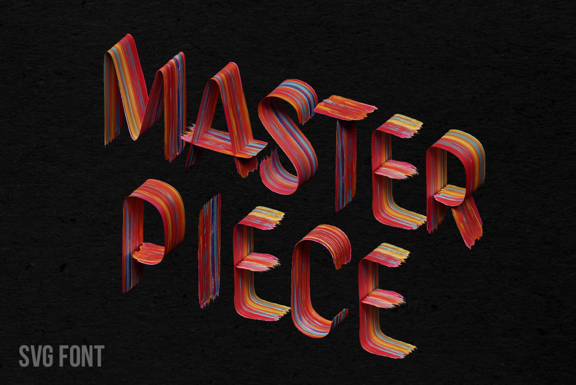
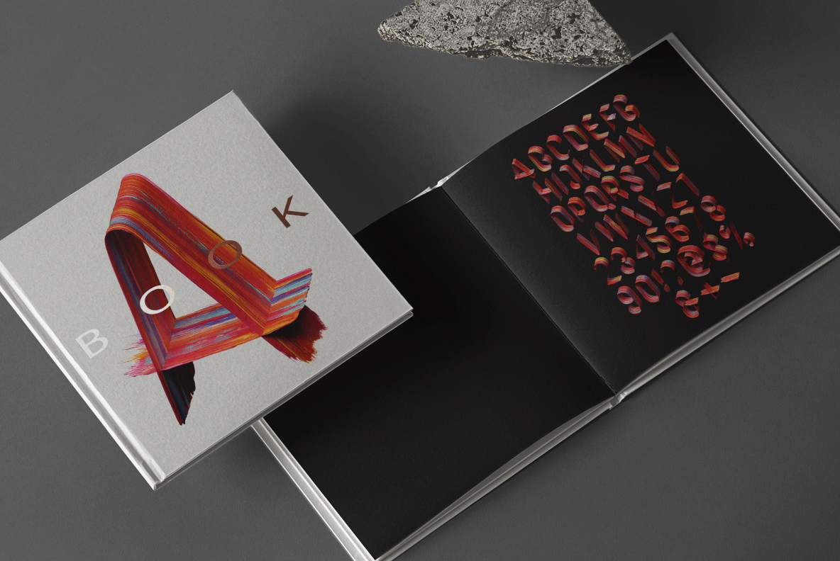
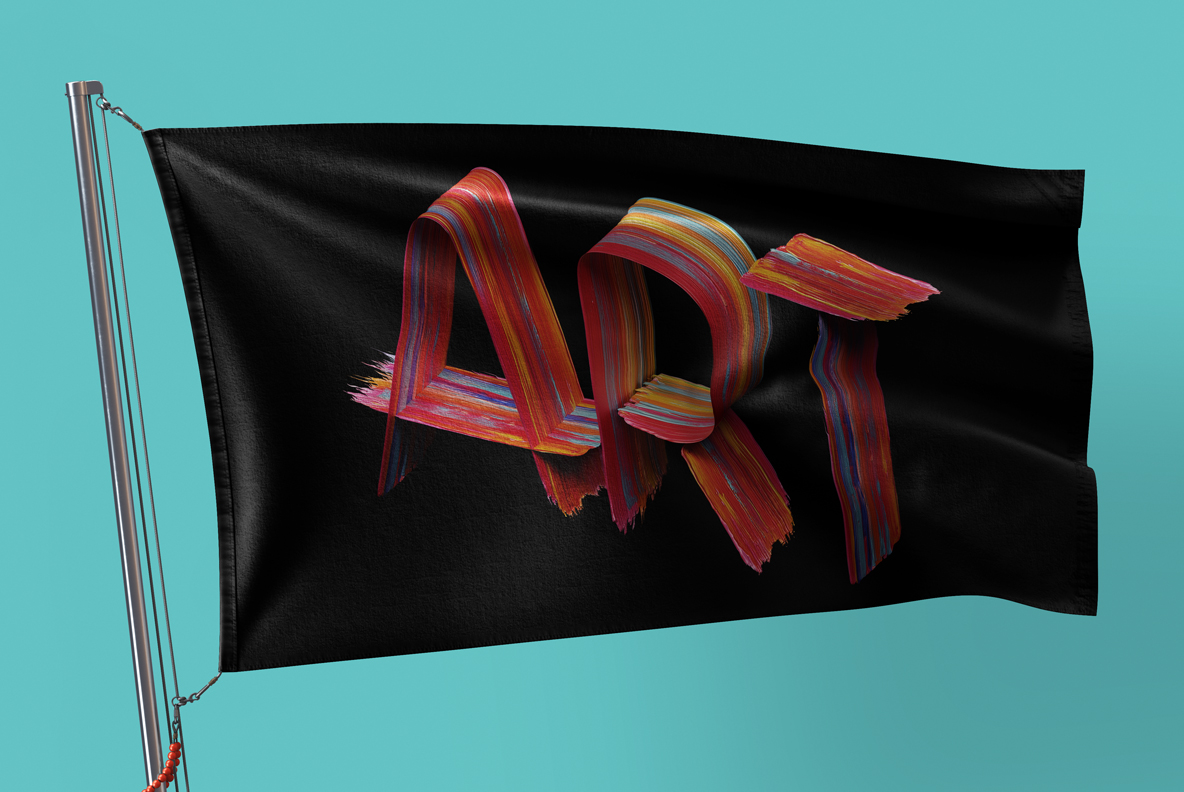
A brush loaded with four colours at once, twisted until the stroke becomes a letter. Masterpiece Font runs deep red, ochre, cobalt and cream in parallel lanes that shift as the ribbon turns, ending in frayed bristle marks. It fits gallery posters, museum campaigns and paint packaging. One OTF types it, with transparent PNG letters alongside.
Masterpiece Font Folds a Loaded Brush Stroke
Load a brush with four colours at once, then twist the stroke into a letter. That is what the Masterpiece Font does on every glyph. Because the ribbon of paint turns as it travels, you see the flat face on one curve and the thin edge on the next. The ends stop in frayed bristle marks, so nothing looks digitally trimmed. Meanwhile the thickness swells and narrows exactly where a real brush would press. The letterforms stay wide and confident underneath, though.
Red, Blue and Cream in the Same Stroke
The palette is the loud part. Deep red dominates, while ochre, cobalt blue and cream run alongside in fine parallel lanes. Since the colours never blend into mud, each stroke stays readable as separate pigment. The lanes shift as the ribbon twists, so one letter can flip from mostly red to mostly blue. Naturally the paint sits glossy and thick, with visible ridges where the bristles dragged. Against black the reds glow, although a cream ground suits it just as well.