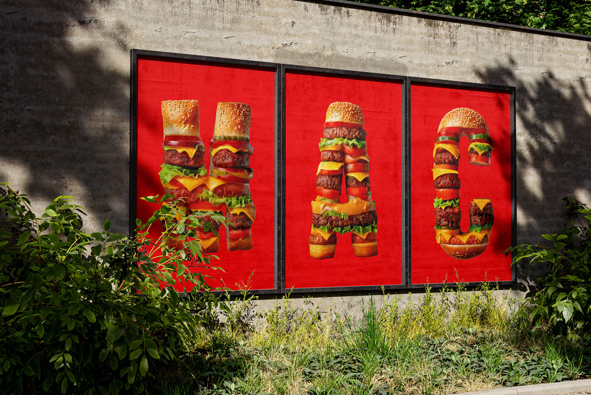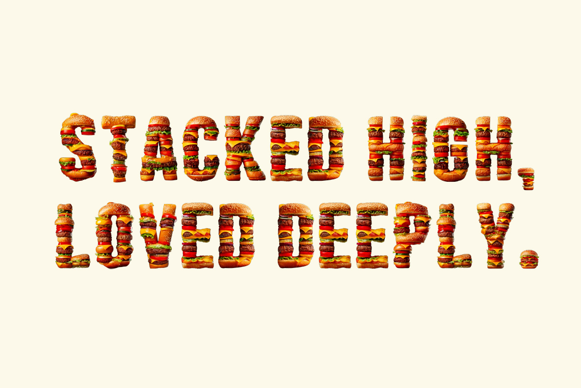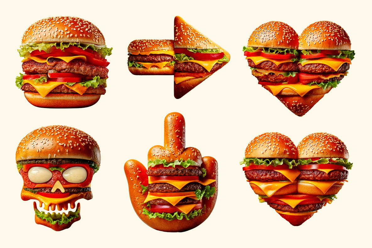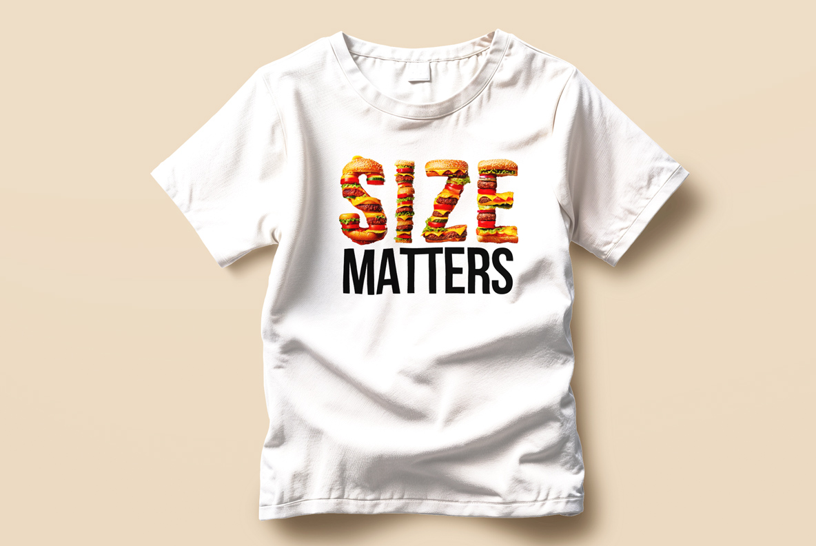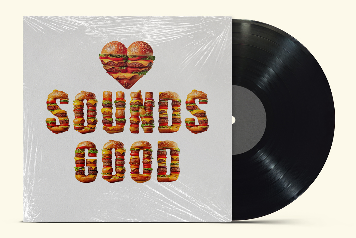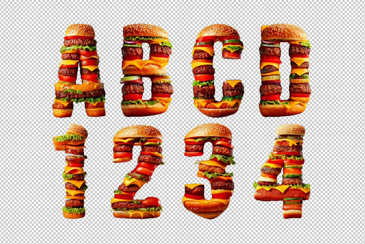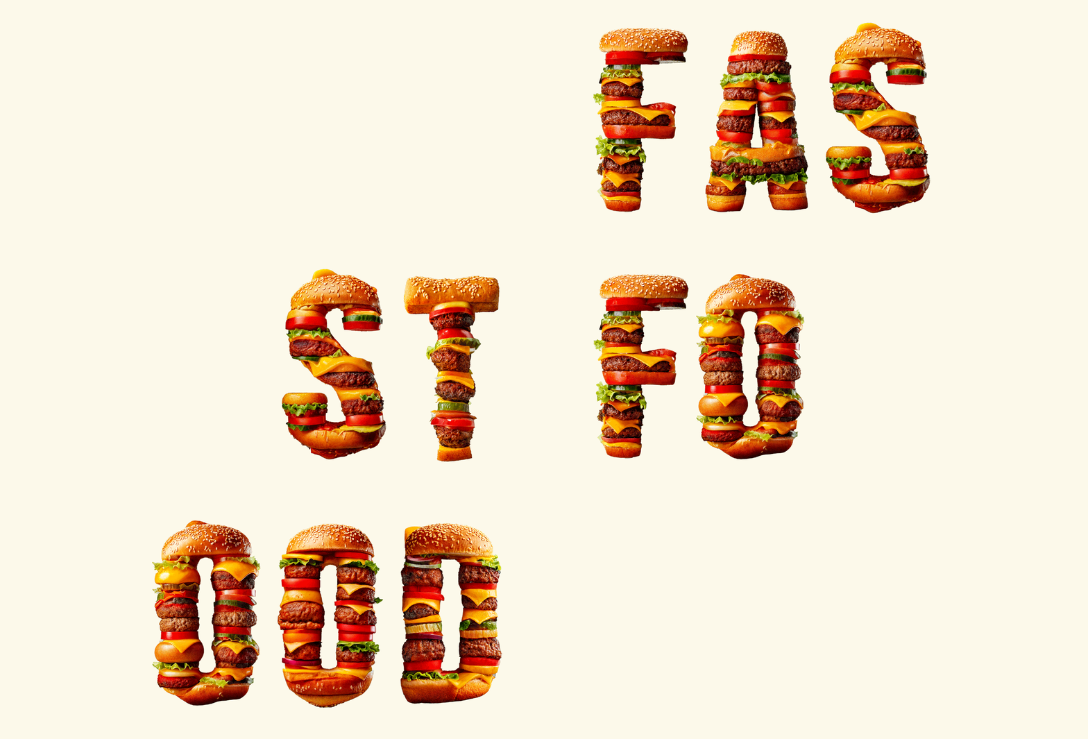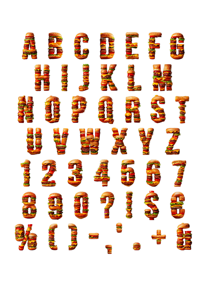
Sesame bun on top, then patties, cheese, lettuce and tomato stacked down to the baseline. The Burger Font hides a wide slab skeleton under all that, which is the only reason a word this greasy still reads. Caps, numerals, currency and punctuation get the same build. Fast-food branding, menu boards, festival posters: anywhere hunger is the goal.
Burger Font Is Built Layer by Layer
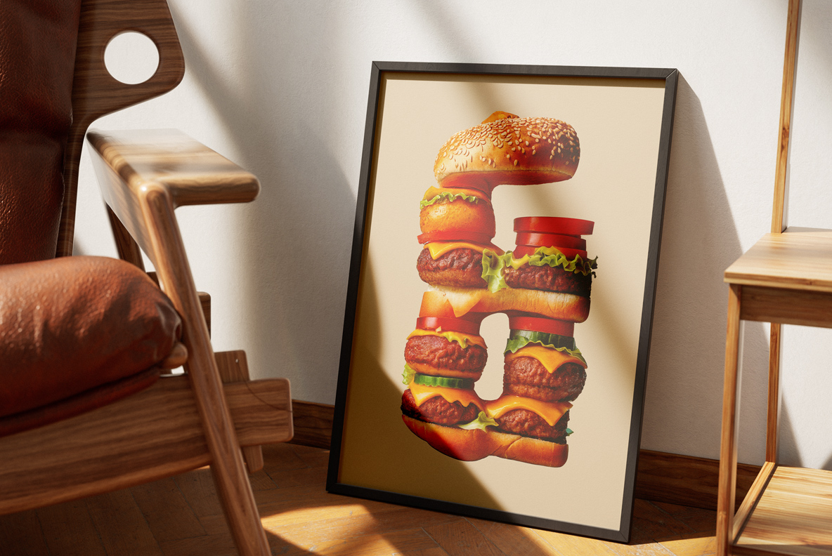
Each glyph is really a stack rather than a silhouette. A sesame bun caps the top, then patties, cheese slices, lettuce and tomato fill the stroke down to the base. Grill marks, sesame seeds and melted edges all survive at full size too. Because the layers differ per letter, no two characters stack identically. So a word looks like a queue of very good burgers. And the Burger Font makes people hungry, which is rather the point.
Readable, Which Food Faces Rarely Are
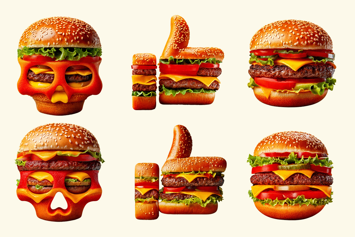
Underneath the toppings sits a wide slab skeleton, so the outline stays obvious. Counters stay open as well, even on the B and the R. Caps run A to Z, while numerals, currency and punctuation get the same treatment. Even the at sign became a pretzel-bun ring, of course. Shrink it to a logo mark and the stack still reads as food. So the set keeps working well past the alphabet.