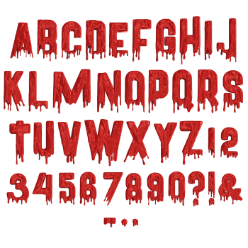
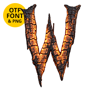
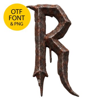
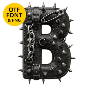
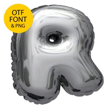
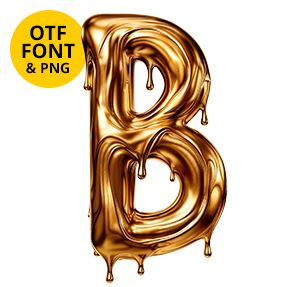
Crimson gloss along the top of every stroke, a drip hanging off the bottom, and highlights that behave like real liquid. The Bloody Vampire Font builds all that on a wide rounded display face, wide enough that the blood decorates the letters instead of swallowing them. Numerals, currency, punctuation and a dripping ampersand are all here. Give it a dark background and one short word.
Bloody Vampire Font Was Poured, Not Lettered
Every glyph started as liquid and then stopped halfway down. Thick crimson gloss runs along the top of each stroke, while the drips hang mid-fall underneath. They look like they are still deciding whether to let go. Because the surface is genuinely wet rather than painted, highlights curve instead of sitting flat. And no two letters drip identically, so a word never looks stamped from one shape. That single detail carries the whole Bloody Vampire Font.
A Chunky Sans Hiding Under the Gore
Strip the blood away and you get a wide, rounded display face. Because that skeleton is heavy, the drips never eat the letterform. Counters stay open too, so words hold together at poster size. You also get numerals, currency, punctuation and a dripping ampersand. Most blood typefaces stop at Z, which is exactly where they become useless. Here, though, nothing goes missing halfway through a headline.