Black Brush Font. Narrow Caps Dragged With a Dry Brush

49.00$ 19.60$

A worn brush, a lot of black paint, and no second coat. The bristles had splayed before the first letter, so every stroke arrives combed into fine hairs with white gaps running through it. The caps are narrow and upright rather than sprawling. Ends fray out into whiskers wherever the brush lifted. It looks made, not drawn.

Read more about licensing

Buy more, pay less — 5 fonts −30%, 10 fonts −50%

The Brush Had Seen Better Days

Nobody reached for a fresh brush here. The bristles had already splayed, so every stroke comes out combed into fine parallel hairs. White gaps run through the thick parts where the paint ran out. Grey shows wherever the brush lifted, then black returns where it pressed down. Ends fray into scratchy whiskers, because a worn brush never stops cleanly. Above all the Black Brush Font holds that dryness across the whole set. The gaps stayed exactly where they landed, naturally.

Narrow on Purpose

Most painted alphabets sprawl sideways, so they eat a line before they say much. Instead the caps here run tall, upright and tightly packed. Stems stay close to vertical, while the crossbars sit high and short. That discipline matters, because the Black Brush Font needs a solid mass for the streaks to read against. Set a headline and the whole line locks together, of course. Widen the tracking, though, and the texture gets its own room.

Animated preview showing dry-brush letters of the Black Brush Font painting themselves in

Where Black Brush Font Goes to Work

Gig posters claim this one before anyone else does. Skate brands, streetwear labels, indie record sleeves and zines all suit it, since none of them want anything polished. Protest graphics work just as well, obviously. It also carries a stencil-ish authority, so warning signs and workwear branding land properly. Print it large, then every bristle line survives. Keep the colour count low, because the texture is already doing plenty.

Inside the Black Brush Font Download

Everything types from one OTF, so nothing unusual happens at install. The PNG letters also ride along separately, transparent and sized for print. A soft wet brush leaves no streaks at all, though, and the rounder wet-brush version shows that difference. Besides that, our collection of paint alphabets holds the strokes, the drips and the rollers.

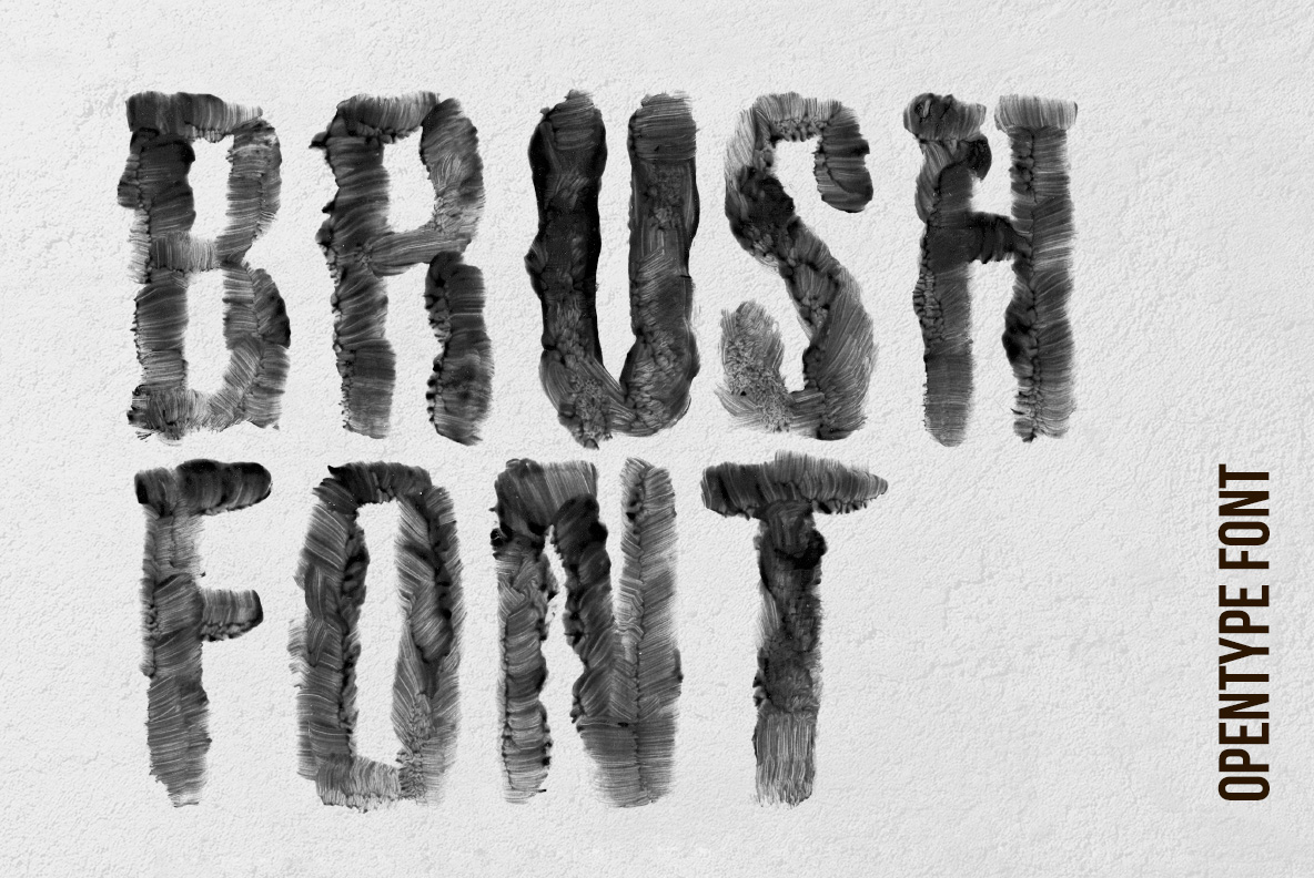
Pale poster reading BRUSH FONT in the Black Brush Font with a small opentype label
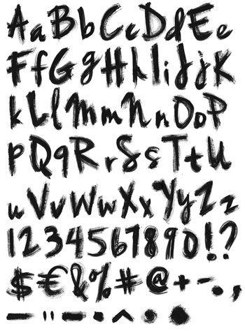
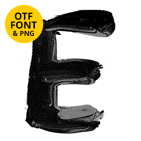
Letter B of the Black Brush Font beside the full alphabet, numerals and punctuation
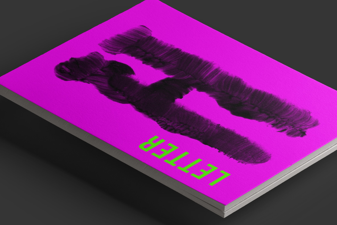
Magenta book cover mockup with a painted letter from the Black Brush Font
Stack of yellow books with a three-line title set in the Black Brush Font
Takeaway cup and paper bag printed with three short lines in the Black Brush Font
Build your font bundle offer: 2 fonts 20% off, 5 fonts 30% off, 10 fonts 50% off, applied automatically at checkout
Blue t-shirt printed with the word art in the Black Brush Font
Poster on a wooden hanger carrying a short saying about art set in the Black Brush Font
Open book with a large two-word heading set in the Black Brush Font beside body text
Letters A to D and digits of the Black Brush Font on a transparent checkered background
Updating…
  • No products in the cart.