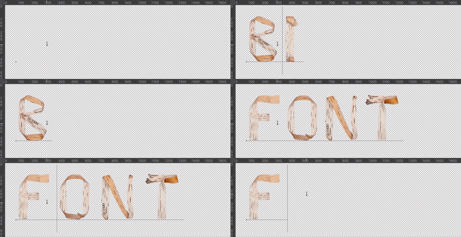
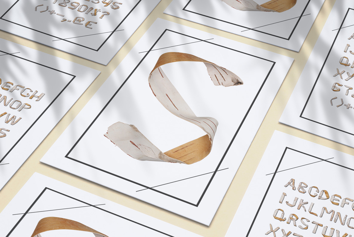
Birch Bark Font bends long strips of peeled birch into letters, twisting them so both faces show. The outer side stays chalk-white with black scars, while the inner side glows warm honey. Torn ends and small curls stay exactly where they fell, so nothing looks trimmed or tidied up. The strips look freshly pulled from a living trunk.
Two Sides of the Same Strip
Birch peels in ribbons, and the Birch Bark Font uses that habit directly. Each stroke is one strip bent into place, twisting as it goes, so white bark and honey inner wood alternate down a single letter. The black lenticel dashes ride along the pale side, while the warm side stays clean. Because the twist never repeats, every glyph turns the light differently.
The Birch Bark Font Stays Light on Its Feet
Most nature alphabets get heavy, of course. This one does not, since the strips stay thin and the counters stay open. Strokes taper where the bark narrows, and the joins show small overlaps rather than solid corners. As a result whole sentences stay readable, which is unusual for a material this rough. Small tears along the edges add to that lightness too. Besides, set it big and the scars turn into pattern.