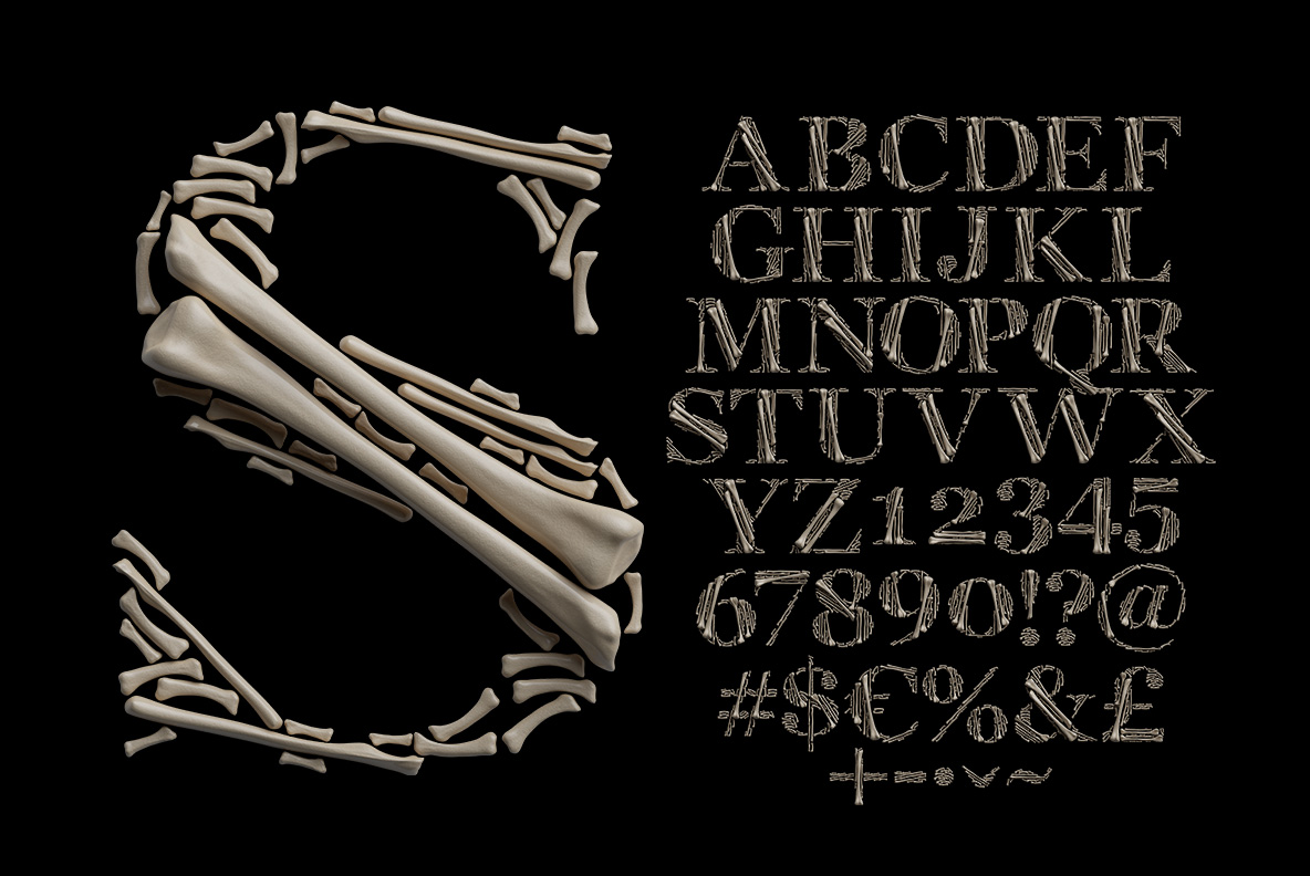
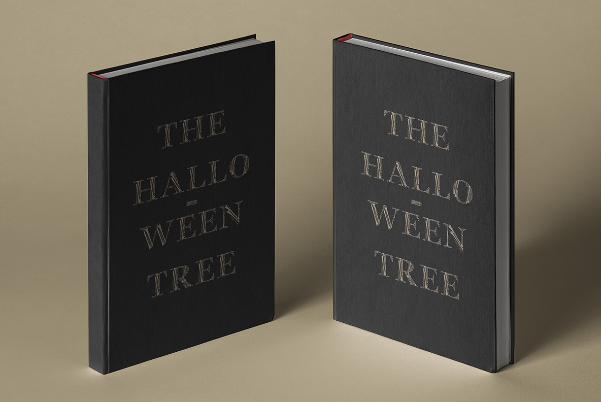
Classical Roman capitals with proper serifs, then filled with stacked femurs, ribs and fragments. The Archaeology Font reads as museum display rather than haunted house, which is why it survives outside Halloween. Caps, numerals, currency and punctuation are all assembled the same way. Print it large, on black or something muted, and keep the body copy quiet.
Archaeology Font Is a Serif First, a Skeleton Second
Look at the shapes and you first find classical Roman capitals, complete with proper serifs and thick-thin stress. Only then do you notice what actually fills them. Femurs, ribs and small fragments stack inside each outline, packed tight enough to hold the letterform. So the effect is museum rather than haunted house. And that restraint is exactly what makes it usable outside October. Even so, the Archaeology Font never quite tips into cartoon horror.
Every Bone Sits Where the Stroke Needs It
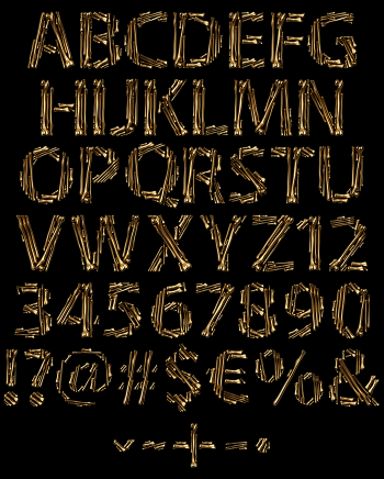
Nothing here is simply a texture stretched over a shape. Long bones run along the stems, while short fragments fill the serifs and joints. Because the pieces vary, no two letters ever repeat their arrangement. Caps cover A to Z, and numerals, currency and punctuation follow the same build. Even the ampersand holds together properly, which is rare. So the coverage holds up well past the alphabet.