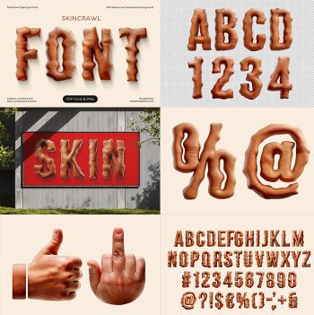
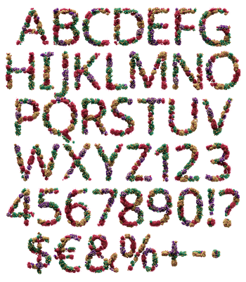
Brain Font wraps a heavy blocky alphabet in pink cortical folds, so every capital looks freshly lifted from a jar. The surface stays soft and slightly wet, with grooves winding across the face and around the edges. Because the letterforms stay simple and wide, the anatomy reads instantly. Numerals and punctuation follow the same recipe.
A Blocky Alphabet With Grey Matter on Top
The shapes themselves are plain. The Brain Font uses wide capitals with flat sides, and no tricks in the skeleton. All the interest sits on the surface instead, where pink folds crawl over every face and wrap the corners. Bowls stay round and stems stay thick, because a busy surface needs a calm shape underneath. Since the letters keep it simple, the texture never turns to mush at a distance.
How the Brain Font Feels Up Close
Zoom in and the grooves keep going. Each fold casts its own shadow, so the letter reads as a solid object rather than a printed pattern. The colour sits between rose and grey, while a light sheen runs across the top. Nothing about it is bright, and that restraint keeps the whole thing out of cartoon territory. The small wince you feel, of course, is the point.