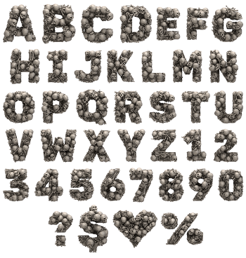
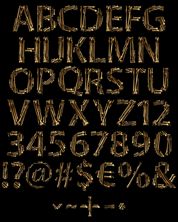
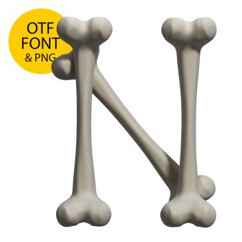
Real bones, laid end to end until they spell something. Three or four thick shafts make up each letter, with the ball joints swelling where they meet. Colour drifts from bleached cream at the knuckles to warm tan down the middle. Gnaw marks cover the surface, so nothing looks manufactured. It is grim and oddly friendly at once.
Bones, End to End
Each letter takes three or four separate bones and butts them together. The joins show, so you can count the pieces in every glyph. Big ball joints swell at both ends of each shaft, while the shafts themselves stay smooth and slightly curved. Colour runs from bleached cream at the knuckles to warm tan along the middle, because real bone never holds one tone. Fine scratches and gnaw marks cover the surface, naturally. The Lovely Bones Font looks found rather than drawn.
Awkward Material, Readable Letters
Bones refuse to bend, so every Lovely Bones Font curve comes from short straight pieces meeting at angles. Look closely and the O turns out to be a rough hexagon, of course. That roughness is the charm, though, since a perfectly smooth bone would stop looking real. Counters stay generous, because thick shafts eat space fast. Shadows fall between overlapping bones, therefore the letters read as objects on a surface.