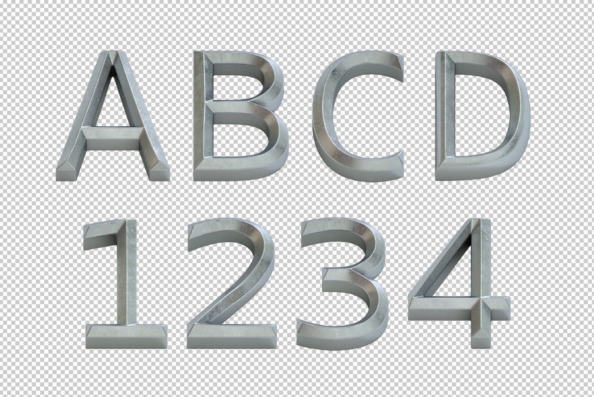
Every stroke is chamfered, so one edge catches a cold highlight and the other drops into shadow. Metal Bevel Font keeps its faces brushed rather than mirrored, with fine machining marks running along each one. It fits music covers, gym brands, motorsport and tool packaging. The download types from a normal OTF and includes transparent PNG letters.
Metal Bevel Font Cuts Its Edges at an Angle
The bevel is the point, so start there. Each stroke in the Metal Bevel Font carries a chamfer, because a flat face alone would look printed. A bright line runs down one side of every letter, while a shadow falls on the other. Since the angle stays consistent, whole words read as one milled block. Then the light does the rest: a cold highlight on top, darker grey below. Naturally the letterforms stay a plain wide sans underneath all that metal.
Brushed Silver, Not Mirror Chrome
Look at the surface and you will see brush marks, not a mirror. Fine parallel scratches run along each face, since real machined aluminium never polishes perfectly flat. That texture keeps reflections soft instead of blinding. Meanwhile the colour sits between grey and silver, cool enough to read as steel. Against dark olive or black, then, the contrast gets genuinely loud. Up close the bevel width stays even, because a sloppy chamfer would give the whole thing away.