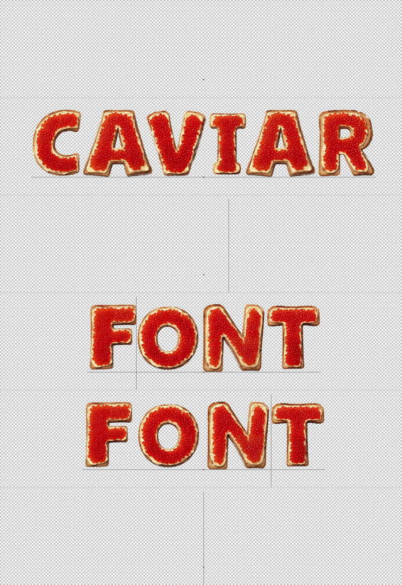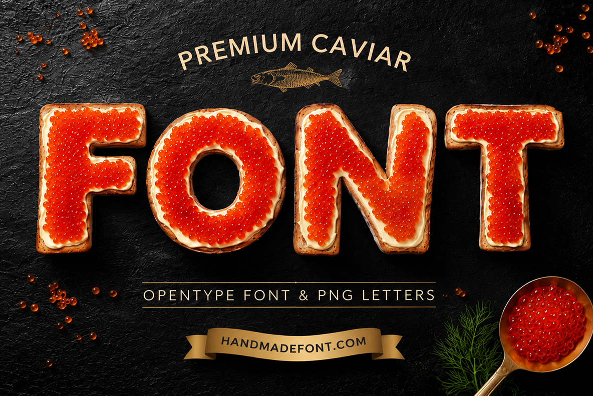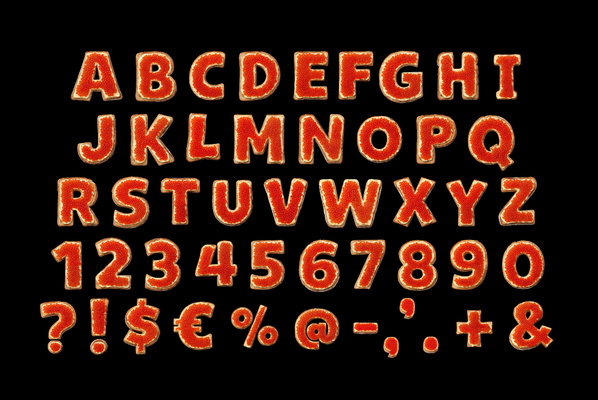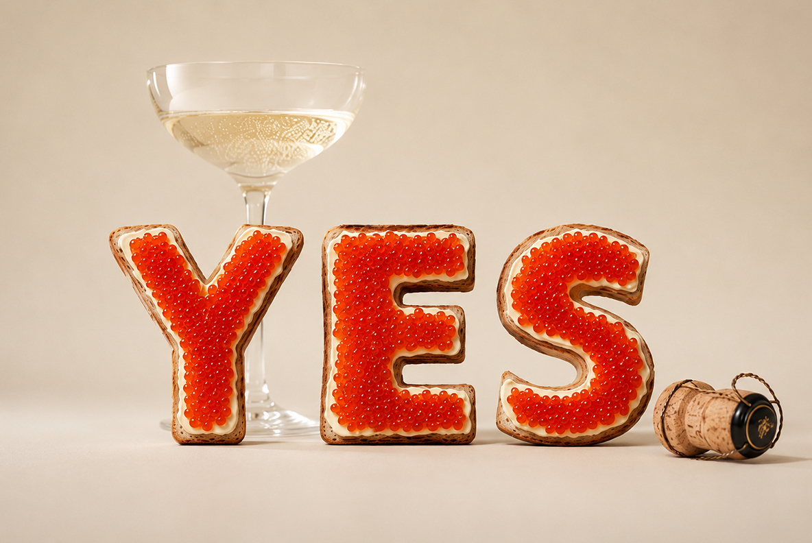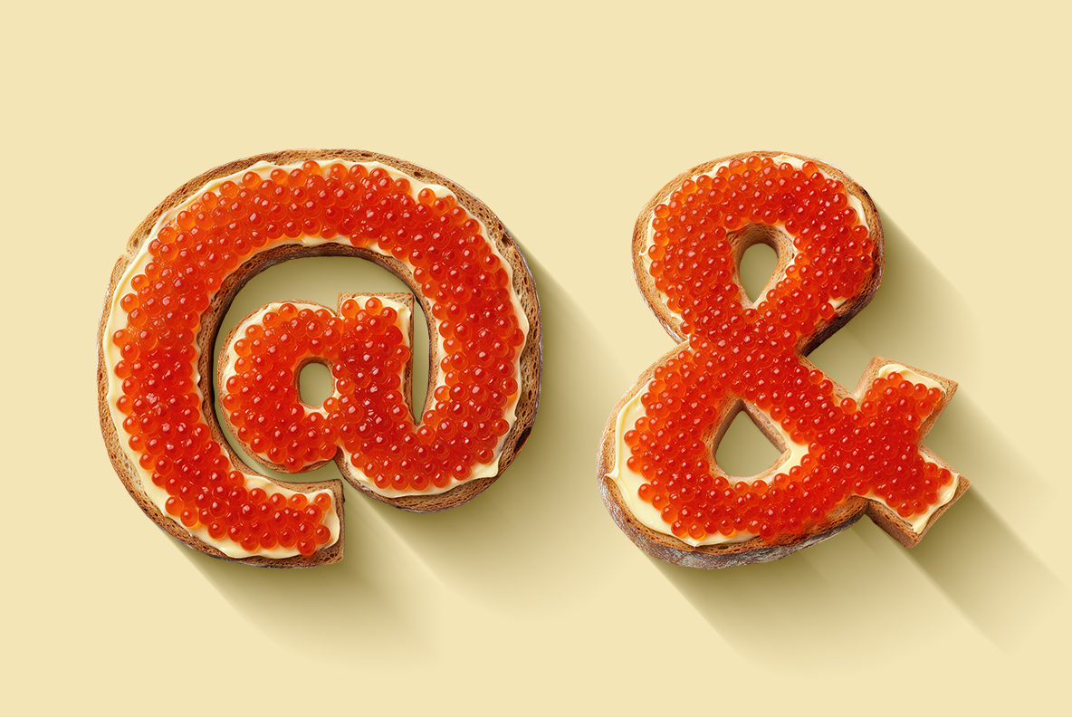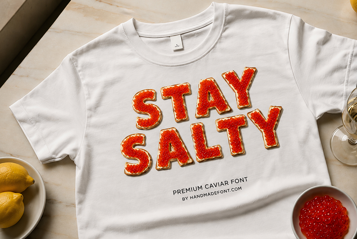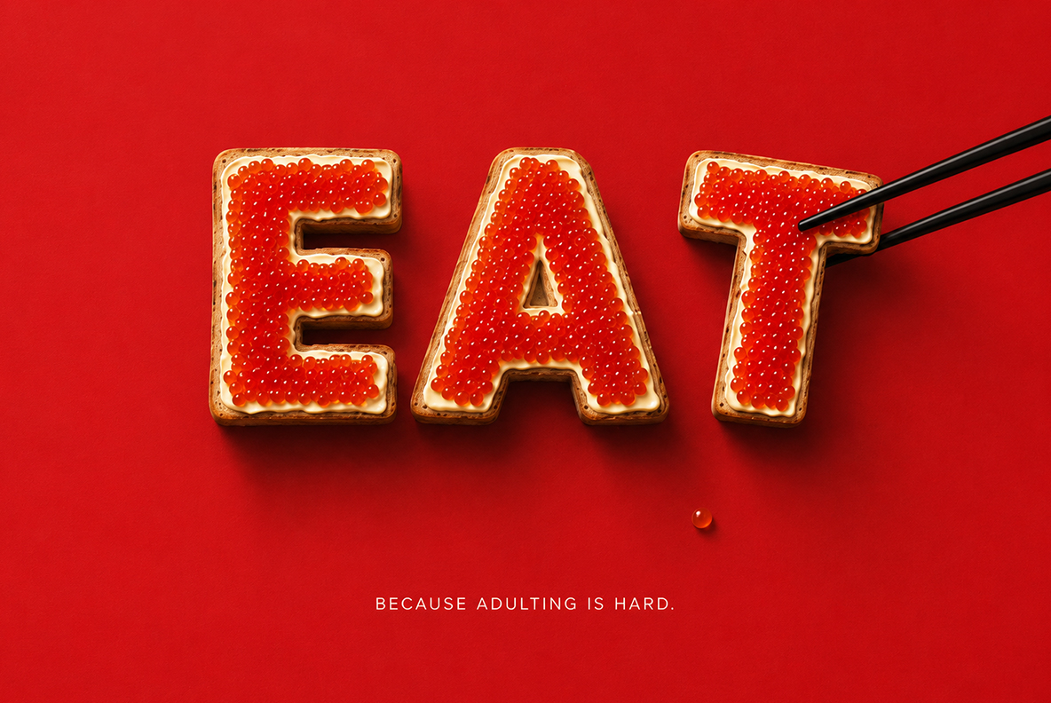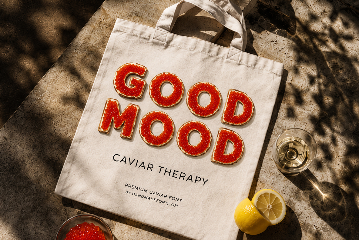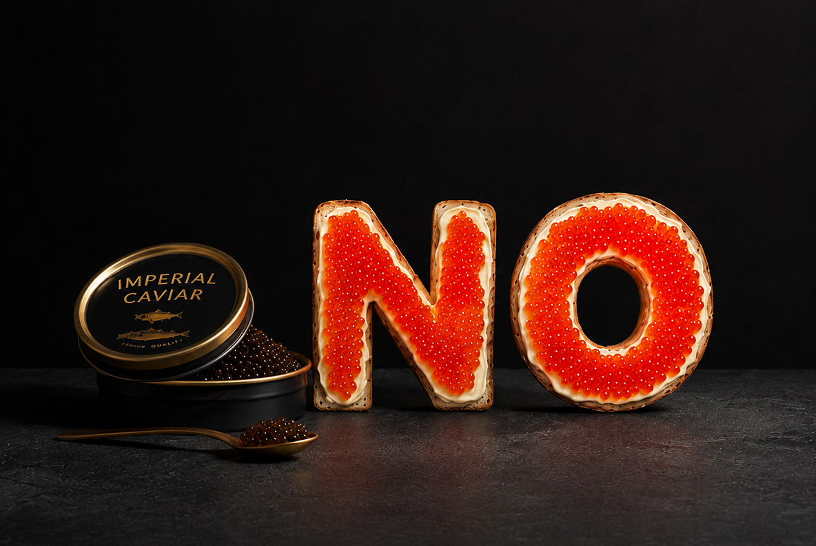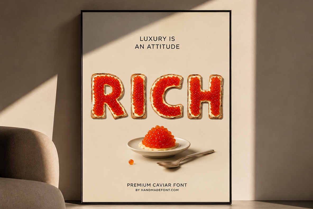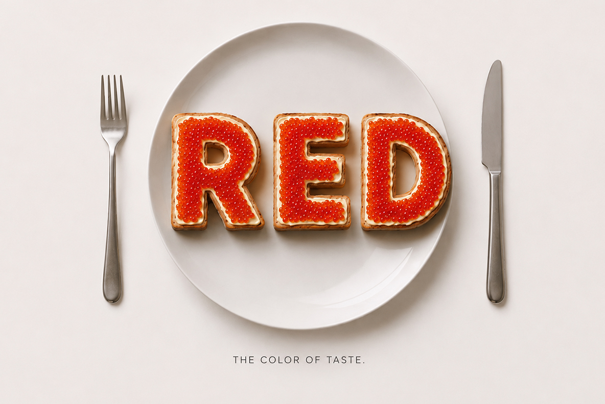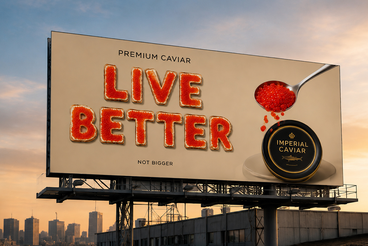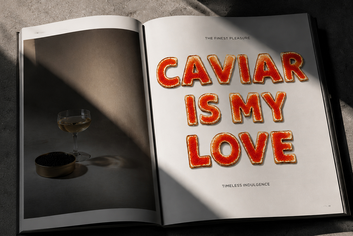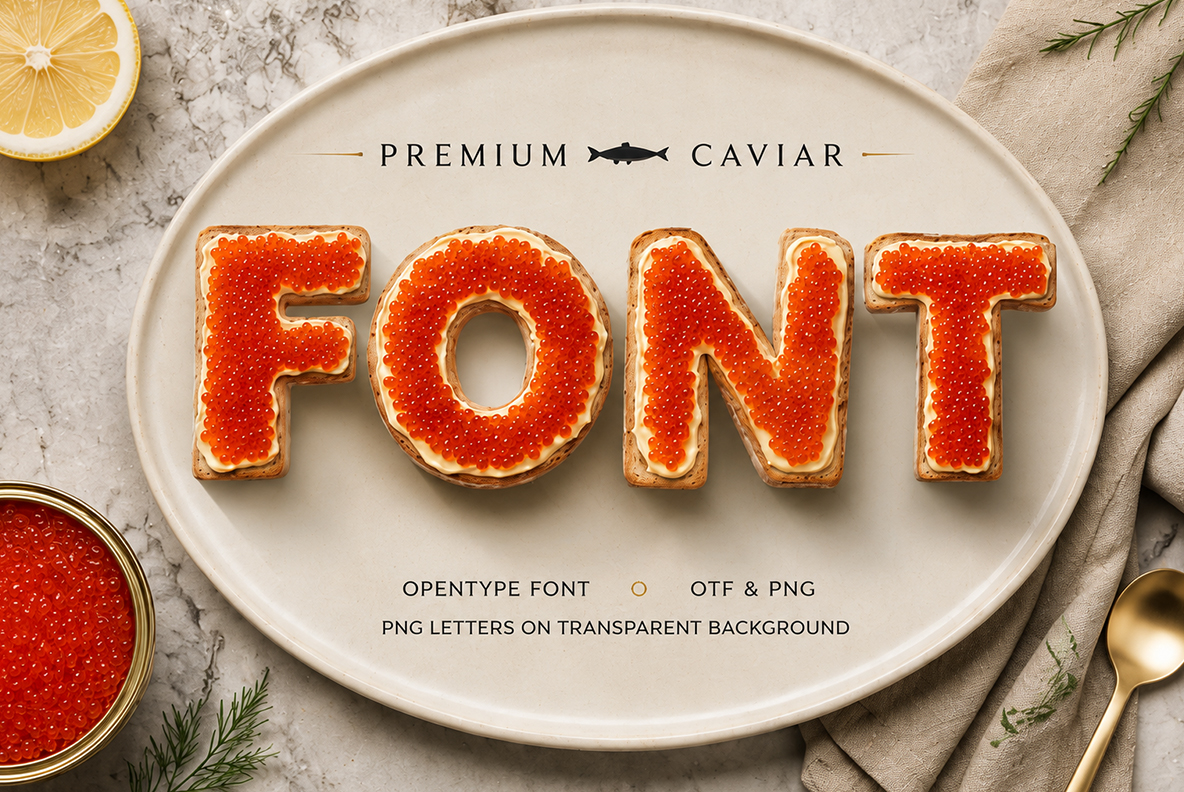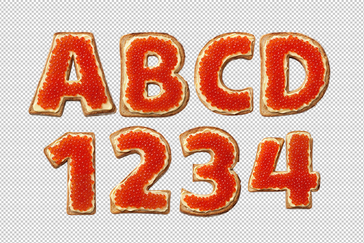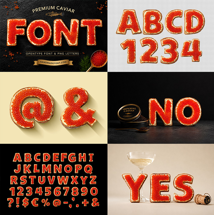
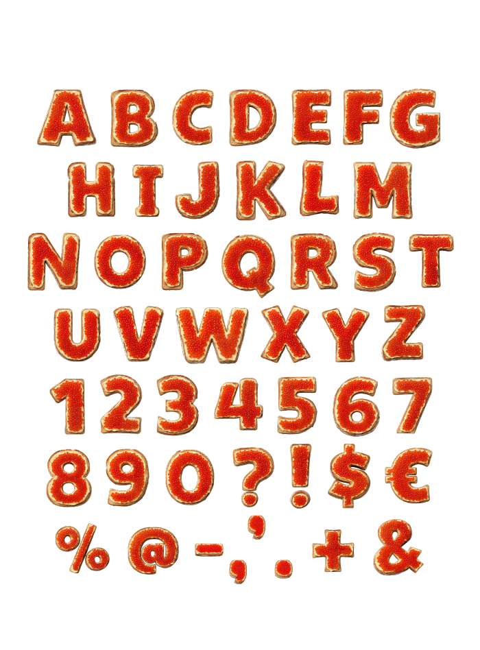
Premium Caviar Font turns each letter into a spoonful of glistening red roe, piled onto golden buttered toast until every character looks worth its weight in champagne. It’s built for anything that needs to whisper “I’m expensive” without saying it out loud — menus, packaging, a smug social post. The set ships as a ready-to-type OTF plus individual transparent PNG letters for pixel-perfect layouts.
A Font That Skipped the Vending Machine
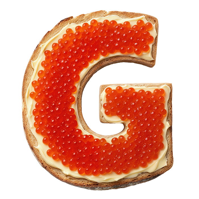
Regular typography just doesn’t have the nerve to look this rich. Premium Caviar Font takes real red roe, spoons it generously onto a slice of toast, and lets the beads settle into the shape of every letter, number, and punctuation mark. The crumb of the bread peeks through at the edges, the butter catches the light, and the roe itself has that unmistakable wet shine that makes you want to lick the screen. It’s food photography pretending to be a typeface, or maybe a typeface that got tired of being flat.