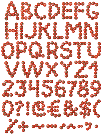
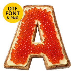
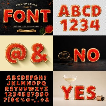
Bright orange flesh with pale marbling lines, and a strip of silver scaly skin wrapped around the bottom edge. Salmon Font looks like it came straight off the fishmonger’s counter, cut into letter shapes. Uppercase, numbers and punctuation, plus separate PNG letters. Ready for menus, seafood packaging, market signage and food editorial.
Salmon Font Is a Steak, Not a Fillet
Look at the edge, and the whole trick is there. Silver scaly skin wraps the bottom of every stroke, exactly as it does on a cut steak. Above it sits the flesh, bright orange and shot through with pale bands of fat. Because the muscle flakes curve, each letter carries its own swirl pattern. So no two glyphs repeat, even when the shapes do.
Appetising First, Typographic Second
The skeleton underneath is a fat rounded sans, and it stays simple on purpose. Since the material is busy, the letterforms cannot be. Colour does the rest, because that orange is hard to ignore on any background. Meanwhile the silver rim gives every letter a base to sit on. Set a word large, and it reads as food before it reads as type. Zoom in, and even the thin fat lines stay sharp.