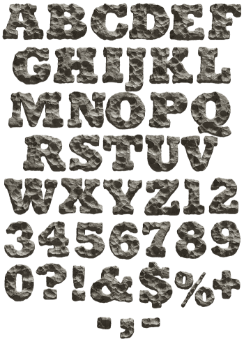
Dark basalt broken into flat facets, with chipped edges and a low matte sheen, packed into a heavy condensed slab. Rock Form Font reads as mass rather than outline. Uppercase, numbers and punctuation, plus separate PNG letters. Built for heavy music covers, climbing brands, gyms and construction work. The numbers and punctuation are cut from the same rock.
Rock Form Font Was Broken, Not Sculpted
Every face here is a fracture plane, so the surfaces meet at hard angles. Dark basalt grey runs through the whole set, and the sheen stays low. Because the facets are flat, light lands in broad patches instead of scattering. Meanwhile the edges chip rather than curve. So each letter looks split off a larger block with one blow.
Heavy Enough to Feel It
The skeleton is a condensed slab, which is why the letters read as mass rather than outline. Since the strokes are thick, the rock has room to show its structure. Counters stay small and dark too, and that adds to the weight. Set a word large, and it sits on the page like something you could not lift. Besides, no two letters break along the same lines.