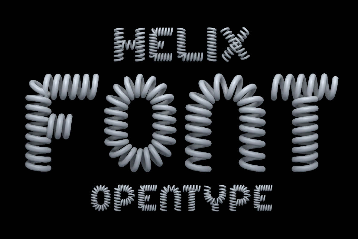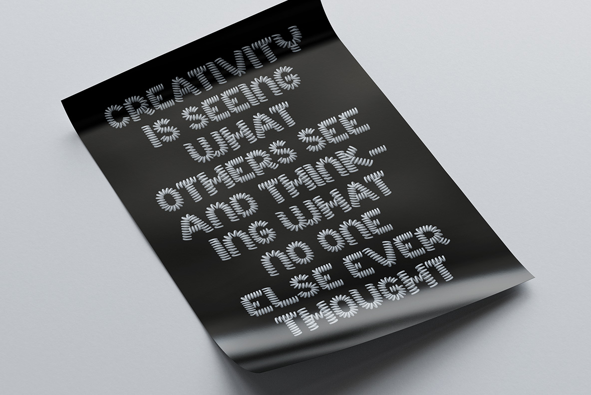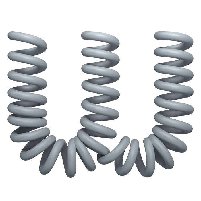
Helix Font builds every letter out of tightly wound metal springs. The coils stack close enough to read as one solid stroke from a distance, then split into separate rings up close. Colour stays inside a narrow pale grey, so the alphabet sits on packaging, posters and covers without fighting whatever artwork is already there.
Helix Font Is Wound From Real Metal Springs
Look closely at any letter and you will find a spring. Each coil is wound tight, pale grey, and finished in soft satin rather than mirror chrome. The coils sit shoulder to shoulder, so from across a room a stroke reads as one solid bar. Step nearer, though, and it breaks into separate rings with real shadows dropped between them. The wire even keeps a faint blue cast where the light catches it. Helix Font never pretends the metal is flat.
Springs Do Not Behave Like Ink
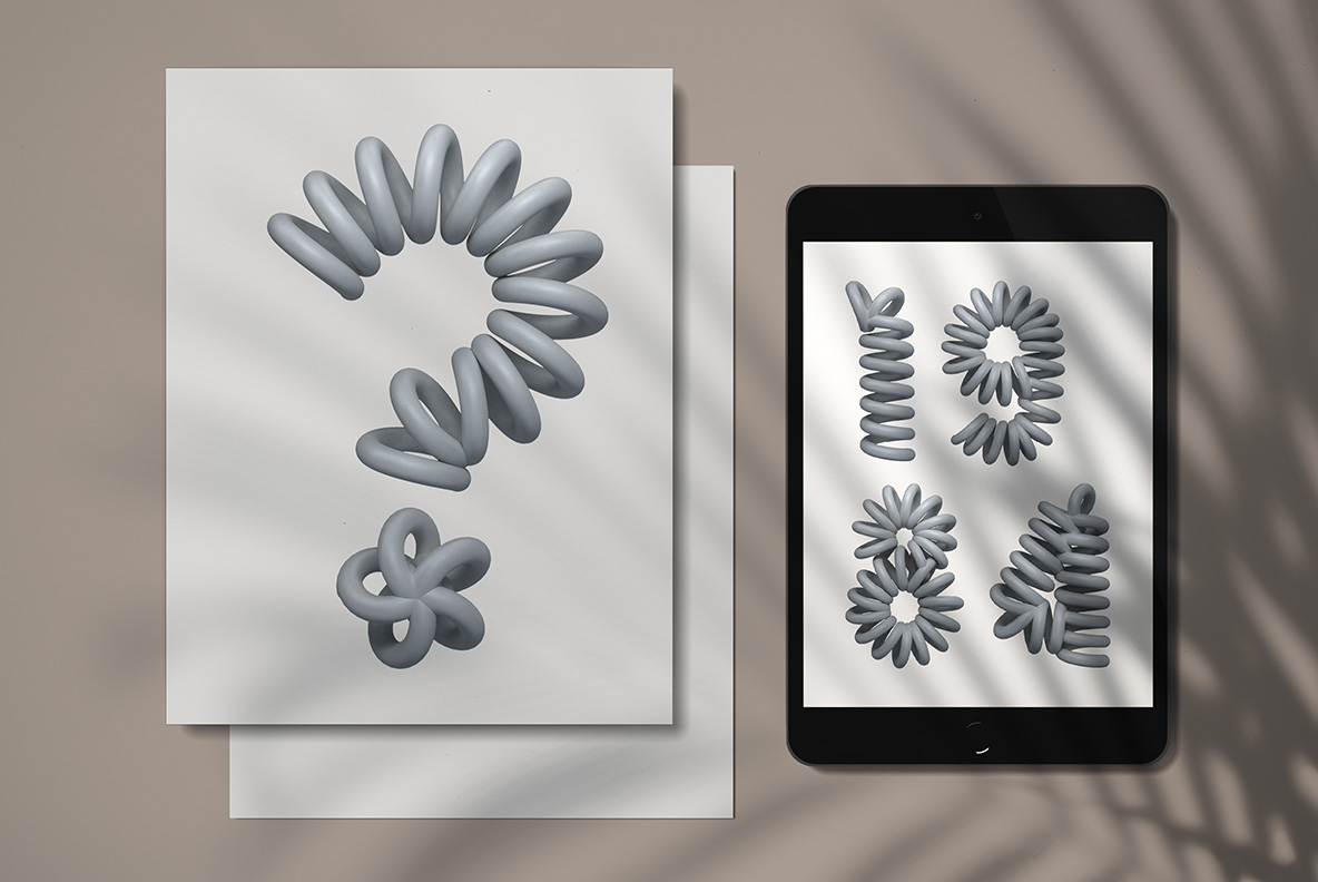
A spring wants to bounce, and these letterforms hold onto that tension. Round shapes such as O and C fan outward, as if the coil were just released. Stems, meanwhile, look ready to squash flat under a thumb. Numbers follow the same rule, so a date or a price gets the same restless energy. Caps and lowercase share the construction too, though the smaller shapes pack their coils tighter.