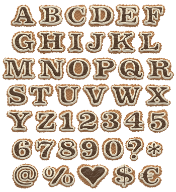
Real Belgian waffles, run through a font machine. Every letter keeps the deep grid, the crisp browned edges, and a lazy pour of chocolate down one side. Somehow it looks warm and slightly sticky at the same time. Put it on a brunch menu, a bakery sign, or a poster that should make people hungry before they finish reading it.
Waffle Drip Font: golden letters with a chocolate problem
Waffle Drip Font is built from thick Belgian waffles, and every letter keeps that deep square grid. The edges are browned and crisp, so the shapes read clearly even at poster size. Then the chocolate arrives. It pools in the pockets, runs down one shoulder, and stops just before it drips off. Nothing is symmetrical, because real syrup never is.
What you actually get in the pack
The download includes an OpenType font, so you can type straight into your layout. Letters, numbers and basic punctuation are all covered. On top of that, every character comes as a transparent PNG at full resolution. Use those when you want to scale one letter up and keep the chocolate detail sharp. There are also extra waffle shapes: a heart, a star, a skull, arrows, a wifi symbol and more.