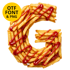
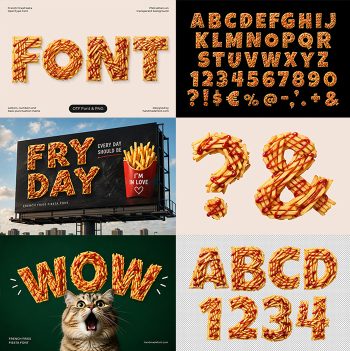
Potato Chips Font turns crisp, golden snack slices into a bold display alphabet with folds, ridges, and toasted edges. Built for food packaging, menus, posters, party invitations, social campaigns, and playful branding, it gives headlines an unmistakable crunch. Each letter looks freshly poured from the bag—fortunately, your keyboard stays free of salt and crumbs.
Typography with a Satisfying Crunch
Potato Chips Font stacks thin, curled chips into substantial letters filled with golden highlights, toasted shadows, and plenty of tactile detail. Every character has its own irregular construction, yet the alphabet keeps a clear, readable rhythm. The result feels appetizing, cheerful, and slightly mischievous—as though snack time has hired an unusually capable art director. Close views reveal tiny bubbles and overlapping wafers that keep the material convincingly photographic.
Made for Flavor-First Design
Use this alphabet for chip bags, street-food menus, festival graphics, picnic invitations, movie-night posters, social posts, restaurant specials, and humorous editorial layouts. Dark charcoal makes the orange tones glow, while cream, tomato red, and vivid green create an energetic food-advertising palette. Browse more edible lettering in our Food Fonts collection. It also works well for bold sale banners where instant appetite matters more than subtlety.