


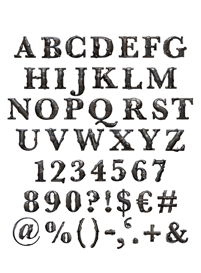
The Knight Armor Font turns the alphabet into forged plate armor — every letter riveted, battle-worn, and built to look like it just walked off a medieval battlefield. It’s a font with genuine weight and texture, made for fantasy branding, game titles, or any design that wants to feel like it means business. Bold headlines have never looked this armored.
Typography Built From Actual Plate Armor
Every letter here is built from real plate armor — riveted metal, articulated joints, and the kind of battle-worn finish you’d expect from a knight who’s seen combat. It’s less a typeface and more a suit of armor that happens to spell things. Forget flat, uniform letterforms: this is typography with weight, texture, and just enough dents to prove it’s been through something.
Built as a Color OpenType, Delivered as PNG Too
The font comes as a high-resolution color OpenType, so every rivet and scratch shows up exactly as photographed the moment you type. It works in any app built for color bitmap fonts — Photoshop, Illustrator, and Procreate among them. Prefer working letter by letter? Every character also ships as an individual PNG on a transparent background, ready to drop into a poster or logo at any size. Uppercase letters, numbers, and basic punctuation are all included.











