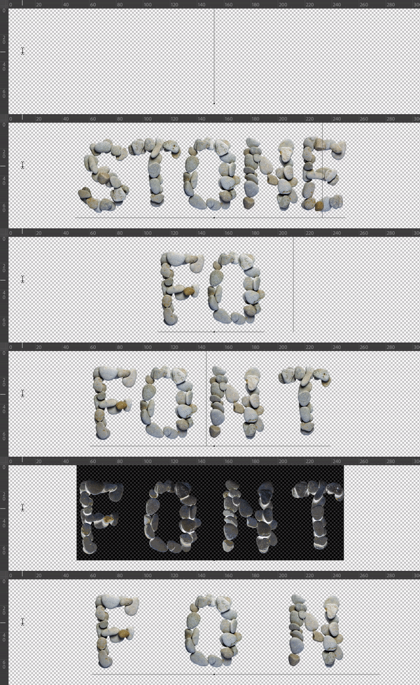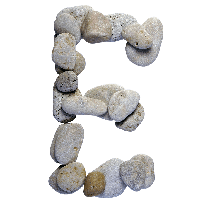
Smooth pale pebbles, water-worn and slightly speckled, laid side by side until a letter appears with small gaps left between them. SPA Stones Font is calm rather than heavy. Uppercase, numbers and punctuation, plus separate PNG letters. Suits wellness brands, yoga studios, retreat posters and quiet packaging. Nothing here is carved, only placed and photographed.
Nobody Carved SPA Stones Font
Nobody cut these shapes, since each letter gathers whole pebbles instead. They sit shoulder to shoulder along the strokes, while small gaps stay open between them. Because the stones are rounded, the outline stays soft everywhere. So a letter reads as an arrangement rather than a solid form. Look closely, and each pebble has its own speckles and worn edges.
Grey, Beige and Very Little Else
The palette runs from cool grey to warm sand, which is exactly why this reads as calm. Since nothing is bright, the alphabet sits quietly beside photography. Meanwhile soft shadows under each stone give the letters weight without shouting. Set it on white plaster, and it looks like a wellness studio wall. Besides, the gaps between stones let the background breathe through.