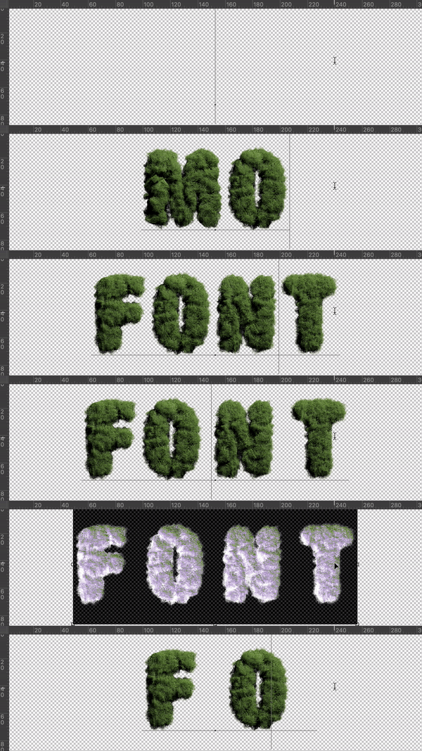
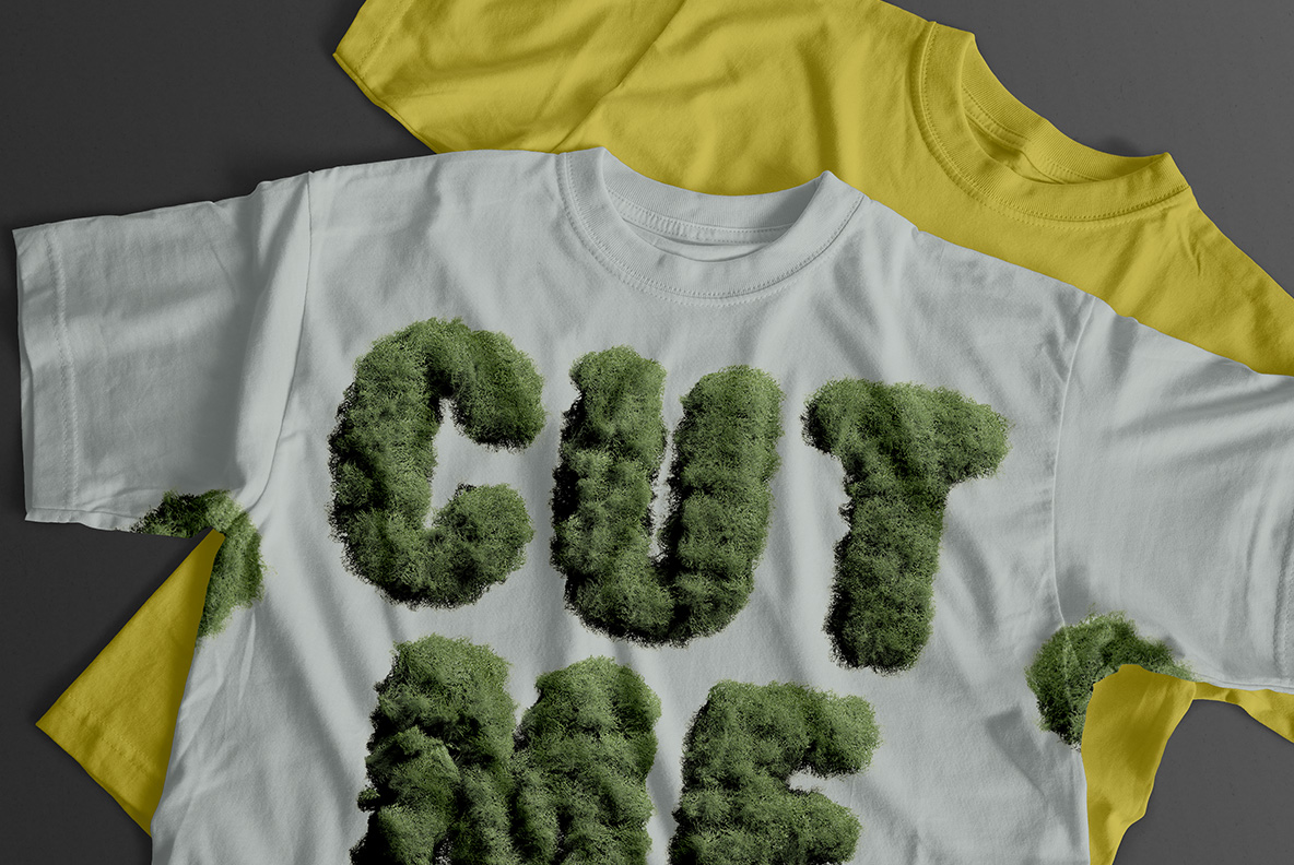
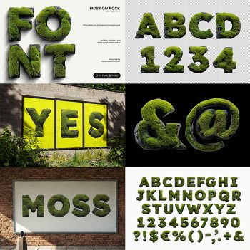
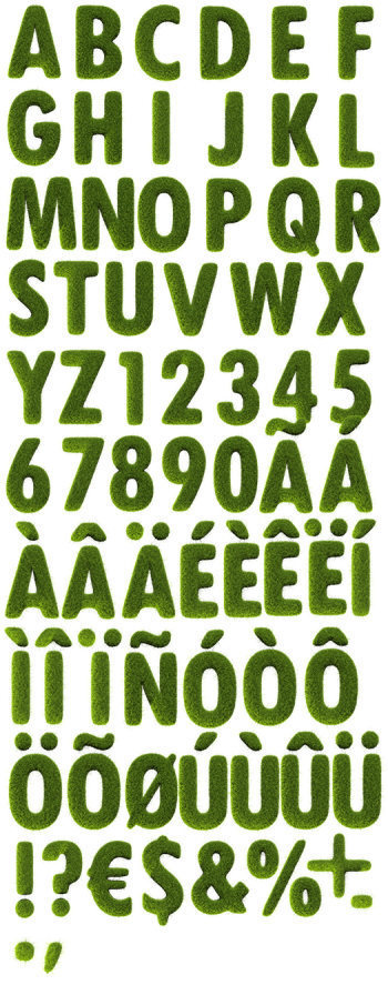
Dark green moss, grown thick enough to spell with. The fronds are lighter at the tips and almost black in the gaps between clumps, and the outline of every letter stays soft and shaggy. Accented characters come along for European languages. It looks damp, cold and freshly pulled off the north-facing side of a wall.
Green, Soft and Slightly Wild
Moss does not hold a straight line, and neither does this alphabet. Each letter is a dense shaggy mass of dark green fronds, lighter at the tips where light reaches and almost black in the shadows between clumps. The outline stays fuzzy on every side. Since the growth varies across each character, a word looks like something that spread rather than something that was set. So the effect holds up even at large sizes.
The Moss Font Has No Hard Edges
Structure survives underneath, which is the surprise. The Moss Font keeps a heavy condensed grotesque skeleton, so counters stay open and a line of text remains readable despite all the fuzz. Accented characters come along for European languages, since the alphabet was built for more than English. Naturally the green shifts slightly per letter, cooler in some and more olive in others, and that small inconsistency is what keeps it from looking like a filter. Above all, nothing repeats.