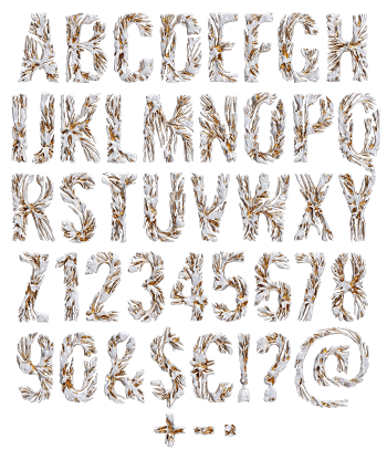
Bacteria Font grows each capital out of a culture. Crimson pom-poms, teal spiky tufts and mustard cauliflower lumps crowd along the stroke, with tiny violet balls filling the gaps. Fine hairs bristle off the colonies, so the outline never settles. The letters underneath stay bold and geometric, which keeps the whole thing legible.
Straight Out of the Petri Dish
Something has clearly been growing here, of course. The Bacteria Font presses round colonies against each other along every stroke, and each one keeps its own colour and texture. Deep crimson sits beside teal green, while mustard clusters fill the corners and small violet balls plug the gaps. Fine hairs bristle out of the clumps, so the outline stays fuzzy at any size. Because nothing repeats, the alphabet looks cultured rather than patterned.
The Bacteria Font Is Colourful Before It Is Creepy
Naturally, the palette does the heavy lifting. Wine red, sea green, ochre and violet also make a set that looks almost decorative from across a room. Move closer, though, and the spikes arrive. That double take is exactly why the font works on a poster. A bold geometric alphabet holds everything together, and that is why the words never dissolve.