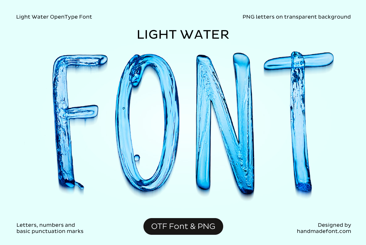
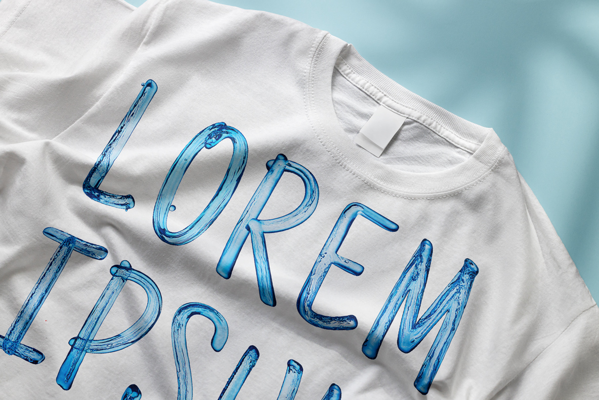
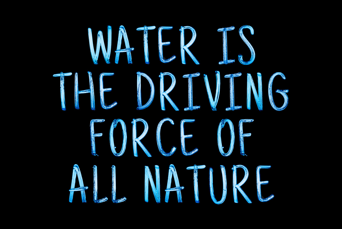
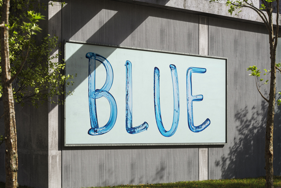
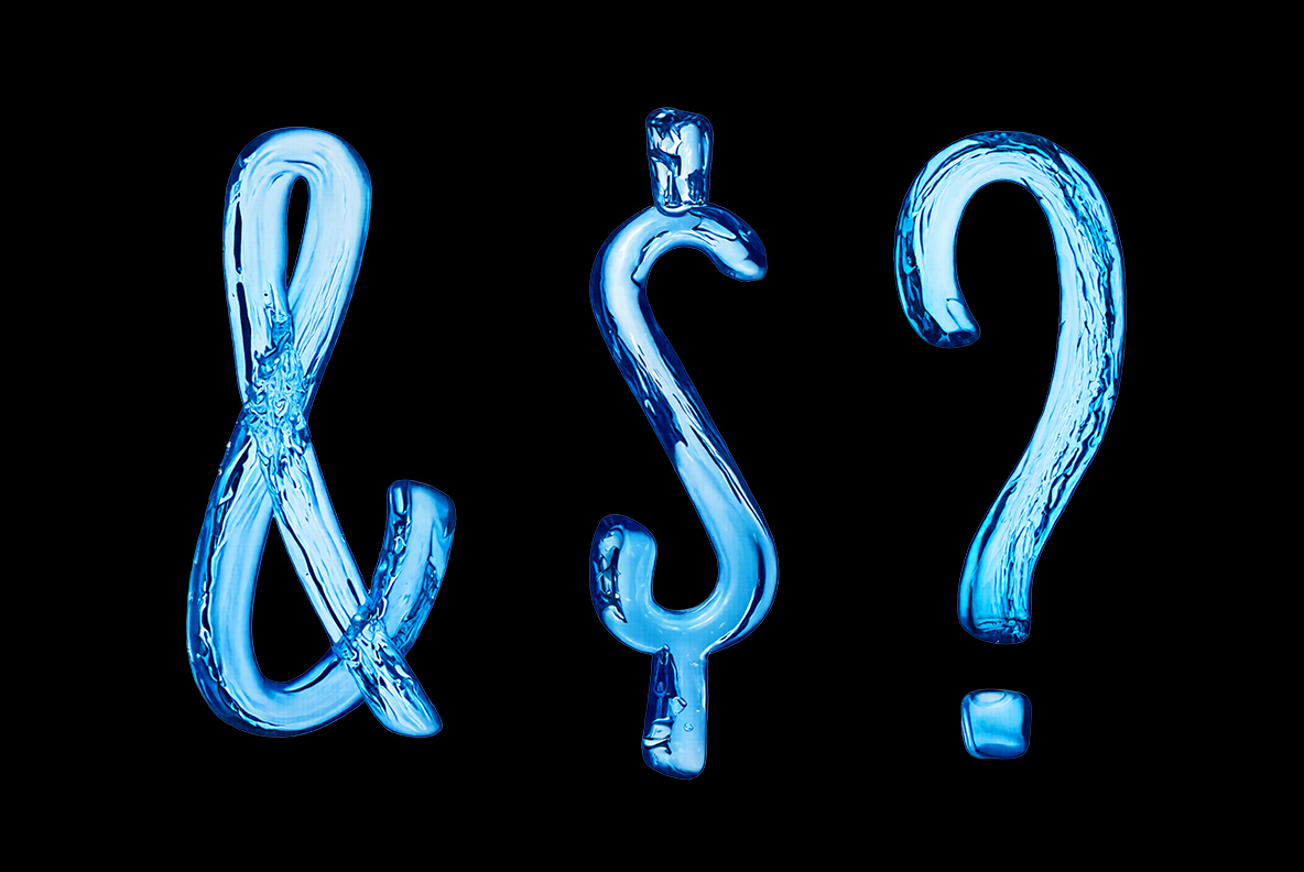
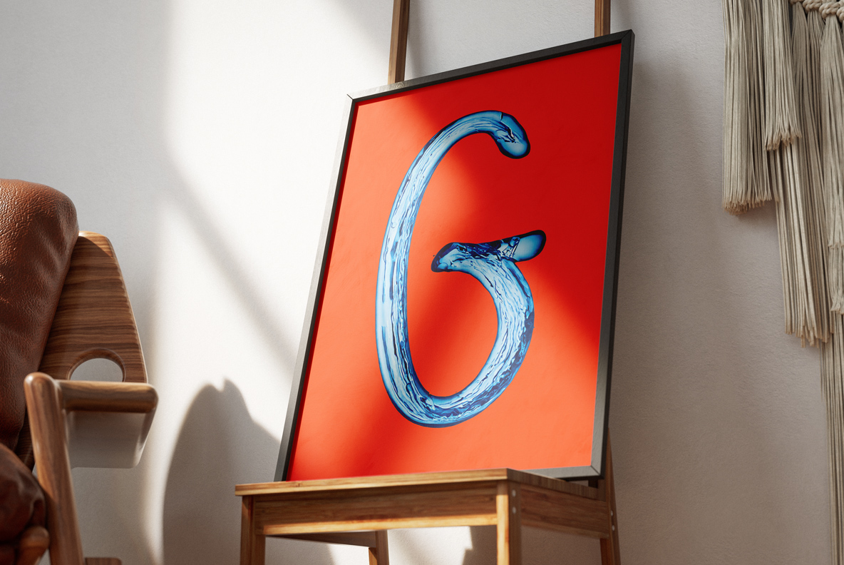
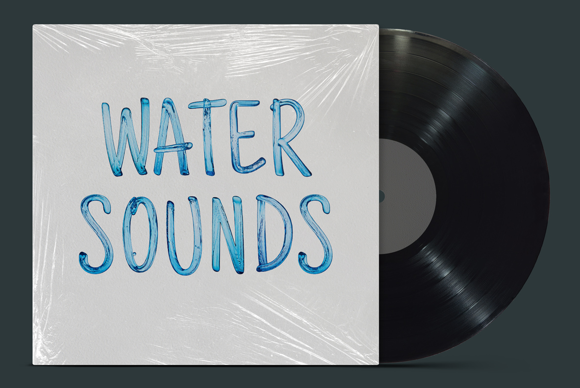
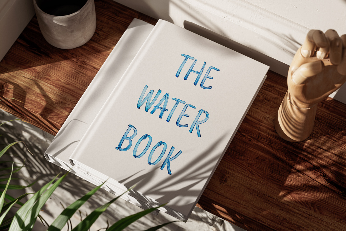
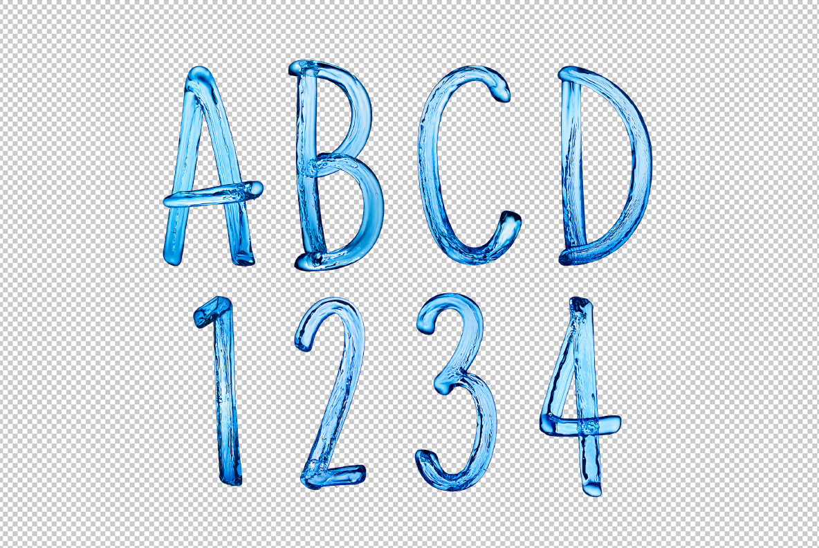
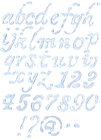
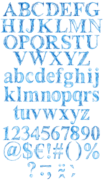
Slim hand-drawn strokes made of pale blue water, with bubbles caught inside and rounded poured ends. The fill stays translucent, so whatever sits behind shows faintly through. It suits wellness and spa brands, bottled drinks, swim and travel work, meditation apps and anything that should feel calm rather than corporate.
Thin strokes with water trapped inside
Each stroke is, in effect, a slim tube of pale blue water. Look closer and you will see bubbles caught inside, along with faint ripples running the length. The ends are rounded rather than cut, so the letters feel poured instead of drawn. Highlights also sit as small white flecks on the upper edge. Because the fill stays translucent, whatever is behind shows faintly through. Naturally, no two strokes carry the same bubble pattern.
Hand-drawn shapes, not a ruled grid
The letterforms, of course, lean towards handwriting. Strokes vary a little in width, and a few curves swing wider than they need to. Baselines shift slightly, meanwhile, which keeps a headline from looking mechanical. Numerals and punctuation follow the same loose rhythm too. Even the ampersand keeps that hand-drawn swing. So a whole sentence reads as calm rather than corporate.