Nails Font. Letters Bent From Steel Nails

49.00$ 34.30$

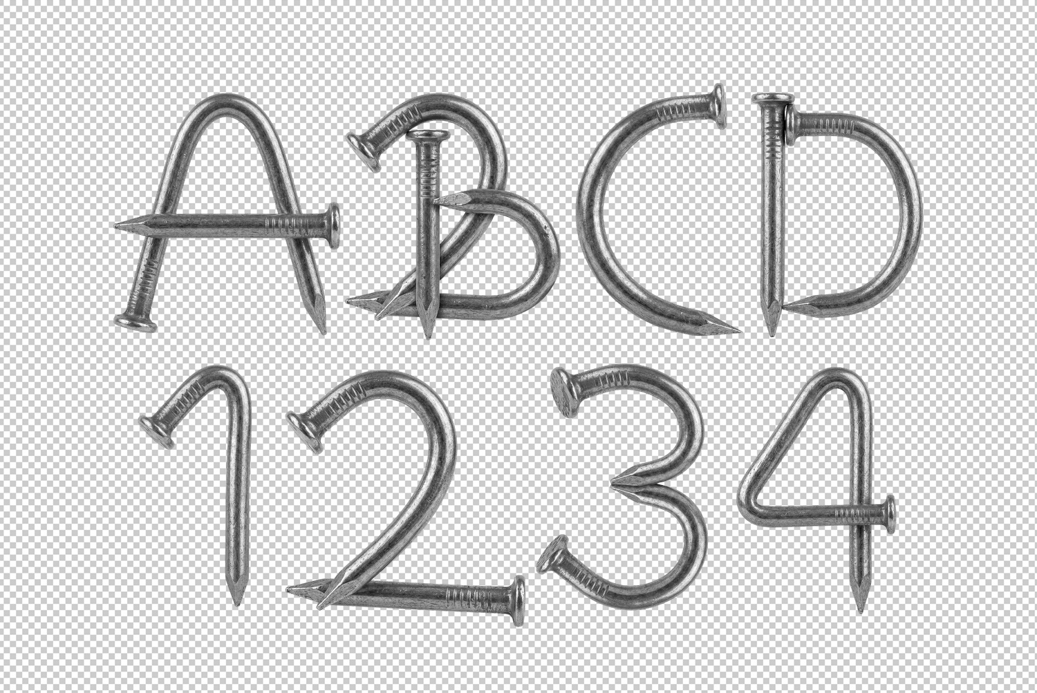
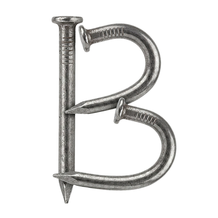
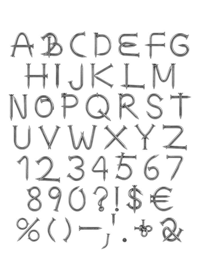
Two or three steel nails, bent by hand and laid down until they read as a letter. Nothing is packed or piled here; every stroke is one nail doing one job, with the head and the point both left visible. The result is thin, wiry and slightly precarious, the way a good workshop sketch looks before anyone tidies it up.

Read more about licensing

Don't forget about our exclusive deal!
  5 Fonts-30% OFF   🔥   10 Fonts-50% OFF  

Two Nails Make a Letter

Most hardware alphabets pile the material up. This one does the opposite, because each character is built from the smallest number of nails that will hold the shape, often two and sometimes three, bent at the shank wherever a curve is needed. Heads and points stay in view, so you can read the construction. Since the nails were shot with a soft studio shadow, the letters look laid on a surface rather than drawn on one.

Why the Nails Font Stays Thin

The Nails Font keeps a light, almost engineered skeleton. Strokes are one nail thick, so counters stay wide open and a word breathes even at small sizes. There is a deliberate wobble, though: joints do not line up perfectly, and a few letters lean. That imperfection is the point, since a machine-straight version would lose the hand entirely. Naturally the steel picks up a cool grey highlight, which keeps the whole set monochrome.
Animated preview of the Nails Font moving through bent nail letters

Workshops, Hardware and Honest Brands

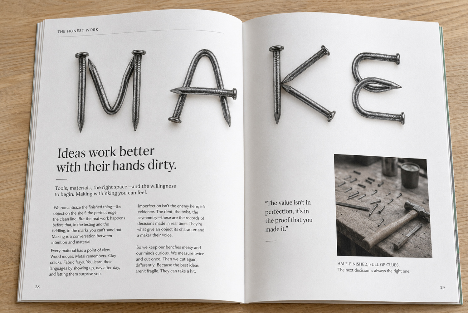
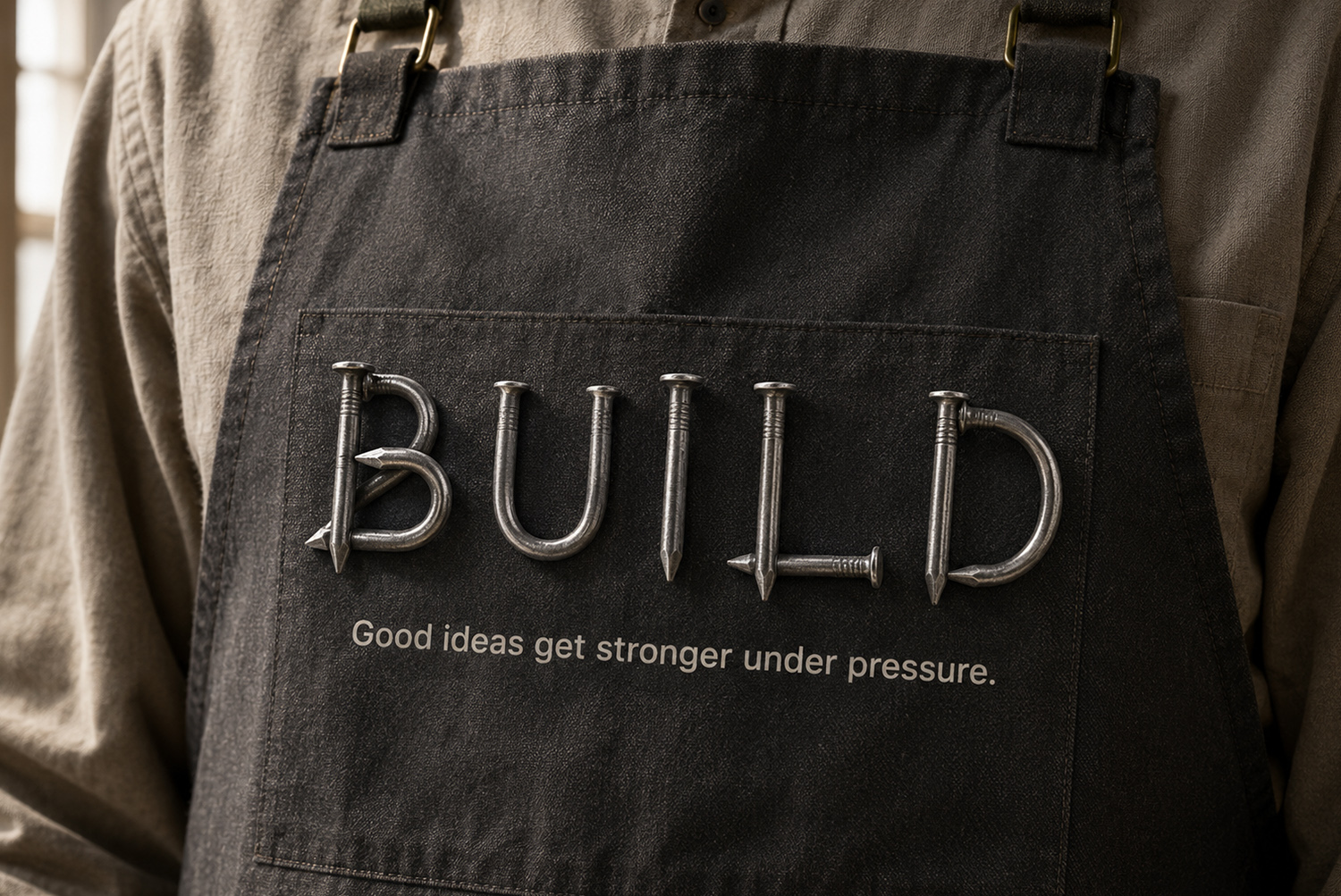
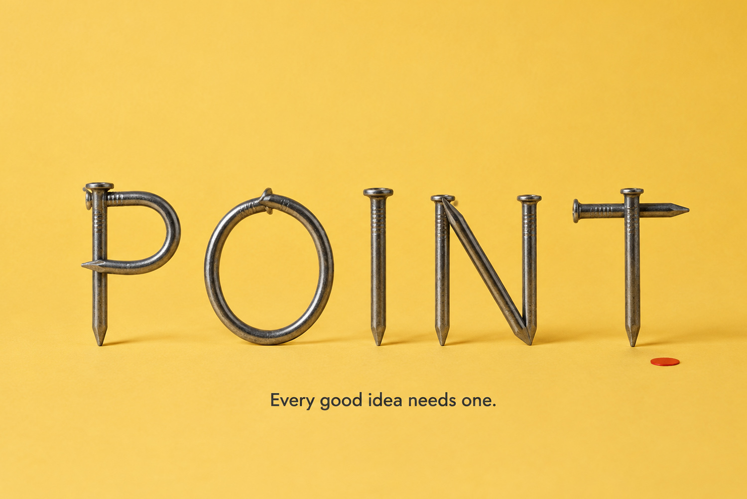
Hardware shops and workshops get first claim on this. In addition, the same steel suits construction branding, DIY magazines, tool packaging, grooming brands, craft beer labels and any campaign built on the word made. The mockups put it on a toolbox lid, a work apron, a magazine spread, a night-lit shopfront and a yellow poster, so you can judge it fast. Besides, a single bent nail already works as a logo mark.

Using the Nails Font

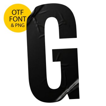
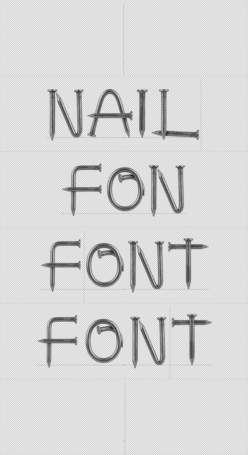
It installs as an ordinary OTF, so the nails fall into place as you type. PNG characters come separately on transparent backgrounds at high resolution, which helps when one letter has to sit on a photograph of real timber. Numerals and punctuation belong to the Nails Font as well, since a price or a date usually turns up on this kind of job. Our older Nail Pile alphabet packs hundreds of nails into every letter instead. More metalwork waits in the Metal Fonts collection.

Pale poster spelling FONT in bent nails of the Nails Font
Alphabet, numbers and symbols of the Nails Font laid out on a dark ground
Green metal toolbox lid reading FIX in the Nails Font beside a hammer
Deep red panel spelling STUCK in the Nails Font
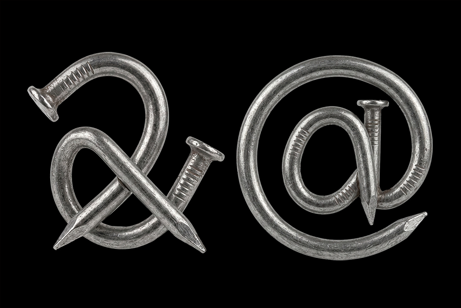
Ampersand and at sign of the Nails Font bent from nails on black
Build your font bundle offer: 2 fonts 20% off, 5 fonts 30% off, 10 fonts 50% off, applied automatically at checkout
Open magazine spread with a headline set in the Nails Font
Pale mint background spelling YES in the Nails Font next to a hammer
Dark canvas work apron printed with a word in the Nails Font
Slate blue background spelling HARD in the Nails Font
Framed print above a wooden counter set in the Nails Font
Bright yellow panel spelling POINT in the Nails Font
Illuminated shopfront sign at night set in the Nails Font
Grey background spelling a short word in the Nails Font
Transparent PNG letters and numerals of the Nails Font on a checkered background
Dark red poster spelling FONT in the Nails Font with loose nails below
Updating
  • No products in the cart.